Accessibility-driven logo system audit: Island Health
Client: Island Health (Vancouver Island Health Authority)
Design problem: The existing Island Health logo system was inaccessible, non-responsive and lacked the structural flexibility required to function across environments. It did not meet accessibility standards or scale effectively across applications. As a result, the logo system did not adequately support a large, complex health authority serving diverse communities across a vast geographic region.
Key challenges: Island Health had used essentially the same visual mark since the organization was established in the early 2000s, so replacing it was not an option. The key challenge was to resolve its accessibility and functional failures while preserving the look recognized by the public. The logo system also had to accommodate a wide range of locations, services and communication channels across Island Health.
Design solution: Resolve the accessibility and structural issues within the existing logo and create an accessible, responsive core logo set with stacked, horizontal and small-scale variations. Introduce a structured framework for logo extensions to improve public recognition of Island Health locations and services. Document the use of both in the Brand Standards documentation.
My role: Led the project from audit through approval and implementation. Conducted the research, defined the strategy, redesigned the core logo set, developed the logo extension framework, and wrote and designed the Brand Standards. Built the case for change, presented the work to leadership, secured approval, and established the guidance required for organization-wide adoption.
Collaborators: Stephen Mullally, Communications Designer — supported accessibility testing, contributed to the development and testing of logo extensions, and played a key role in strengthening the Brand Standards through ongoing feedback and support throughout the project.
Core logo set
01
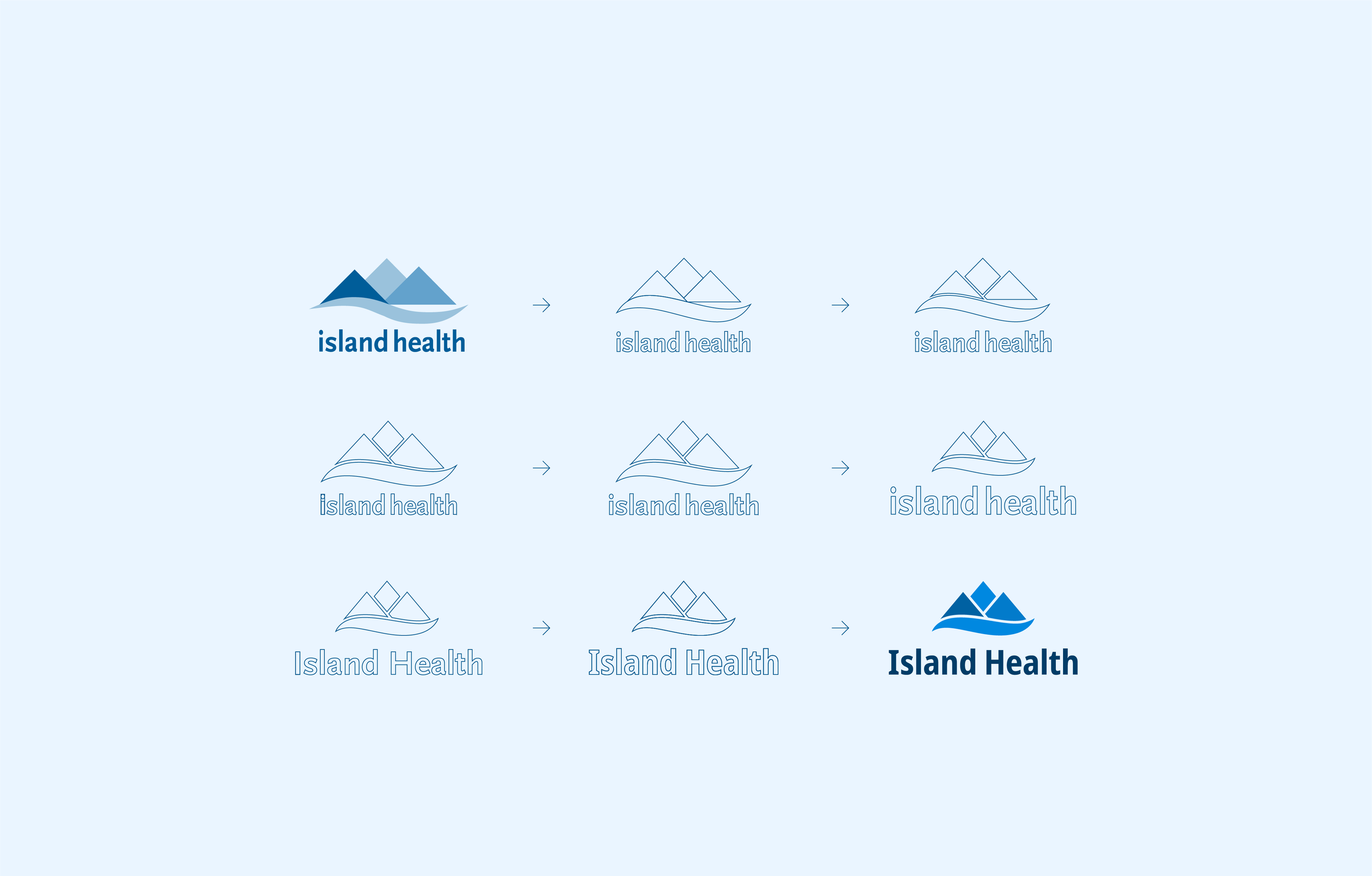
The logo update began with detailed research into its structure, proportions, contrast, legibility and performance across different formats. Each change responded to a specific functional or accessibility issue identified through analysis. Nothing was altered for stylistic preference alone.
The progression below traces the stacked logo through a series of functional refinements. Key improvements included restructuring the visual mark, strengthening colour contrast and perceptual uniformity, and improving the legibility of the wordmark.
Legacy set: key issues
The previous core logo set included only two approved versions: a full-colour stacked logo for light backgrounds and a white stacked logo for dark backgrounds. With no horizontal format or single-colour dark version, the set offered limited flexibility across backgrounds, layouts and production methods. The audit identified poor adaptability, accessibility and legibility concerns, and structural inconsistencies within the set.
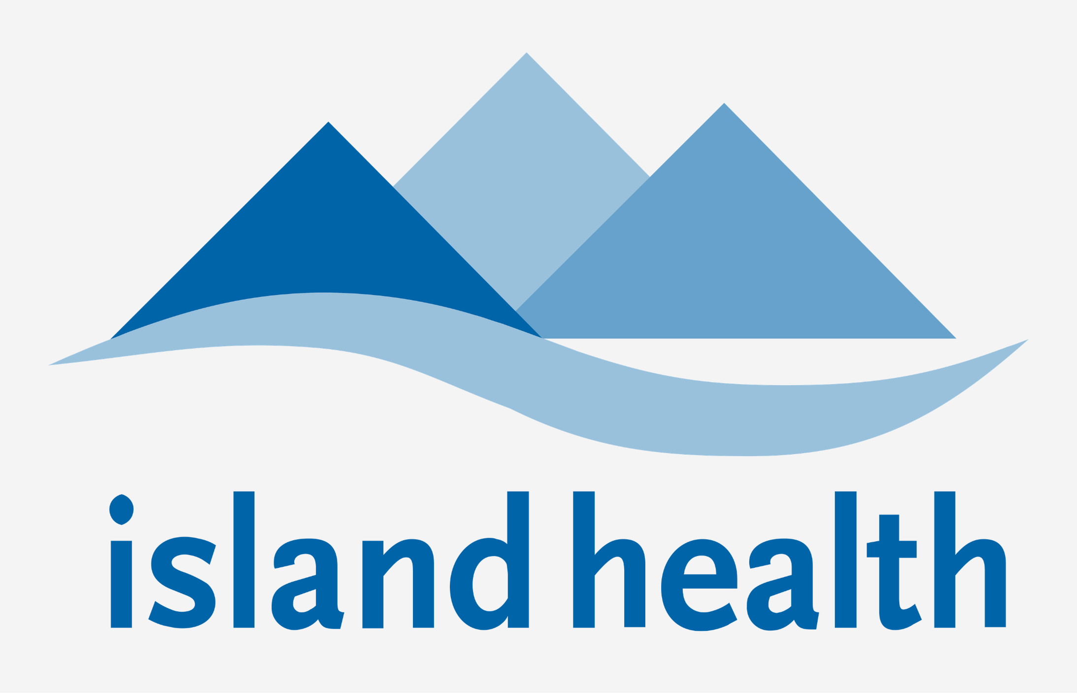
Legacy full-colour logo
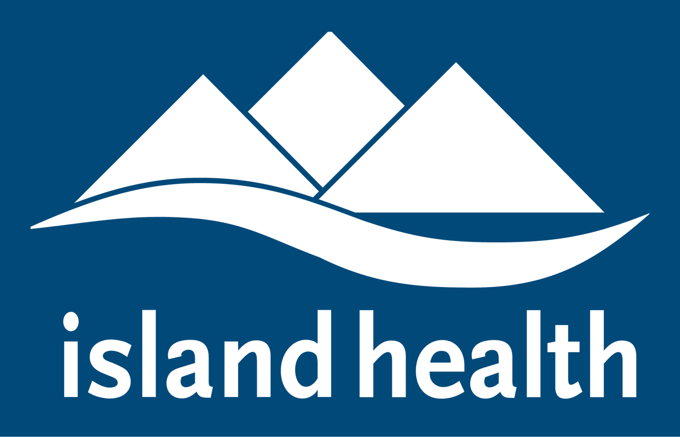
Legacy white logo
Non-responsive
The logo could not adapt effectively to wide, narrow or compact spaces because there were no horizontal formats or approved small-scale versions. At smaller sizes, it became difficult to read or even recognize. This led staff and contractors to create unapproved variations, making Island Health materials, services and locations appear inconsistent and potentially less trustworthy to patients and the public.
Insufficient contrast and legibility
There was no dark logo version in a set. Parts of the full-colour visual mark lack sufficient contrast. The wordmark (text part of the logo) was compressed which made the letterforms hard to distinguished and therefore more difficult to read, especially at smaller sizes.
Structural inconsistencies
The visual mark had multiple structural inconsistencies, uneven proportions and unresolved negative space. The relationship between the visual mark and wordmark was also poorly resolved. The full-colour and white logos used different underlying structures. When recoloured or reproduced in monochrome, overlapping shapes merged and distorted the mark.


New responsive and accessible set
A close examination of the visual mark and wordmark identified problems with structure, proportion, contrast, legibility and performance across sizes, backgrounds and production methods. Each change addressed a defined functional need and followed clear structural and accessibility criteria.
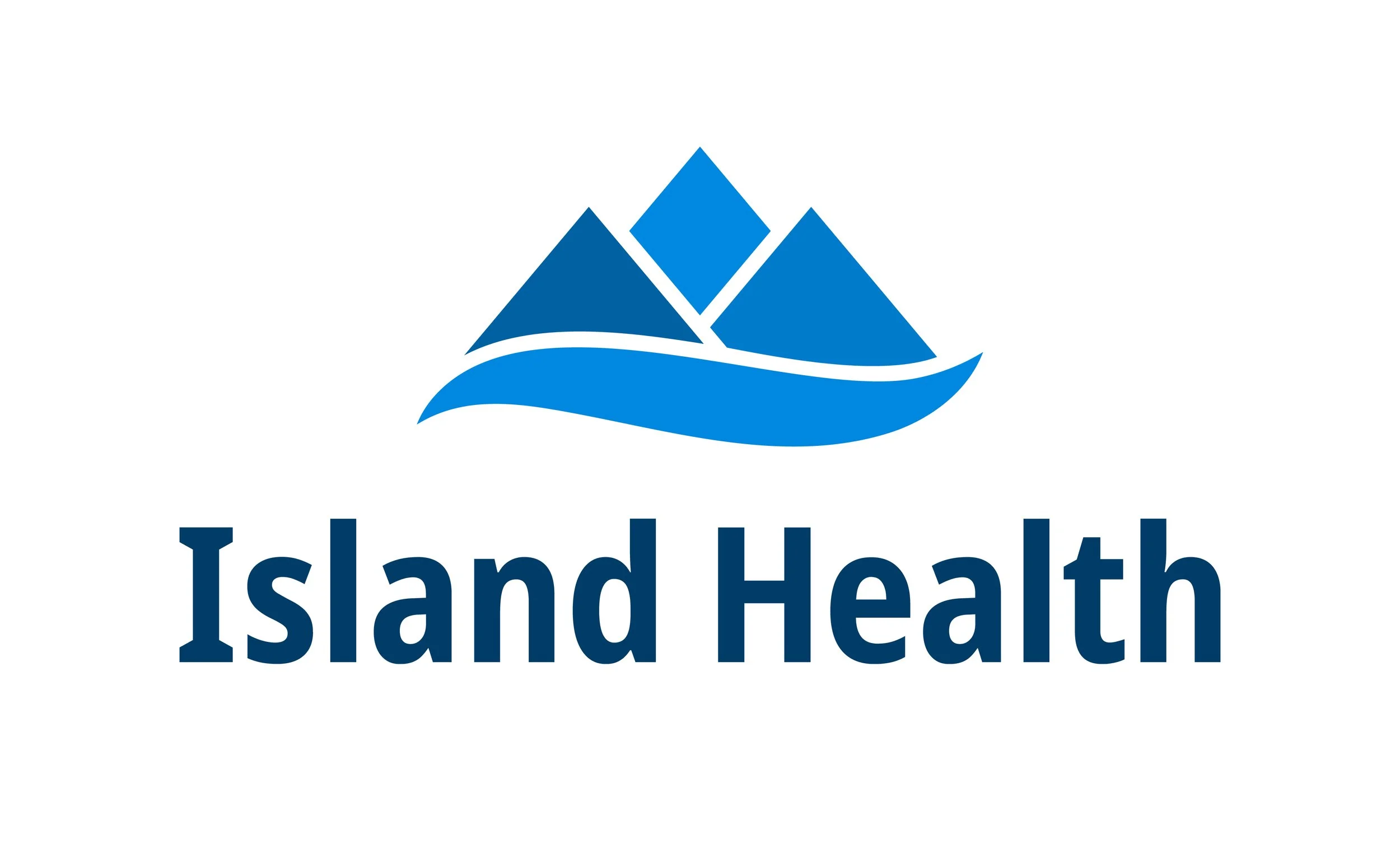
Full-colour stacked logo
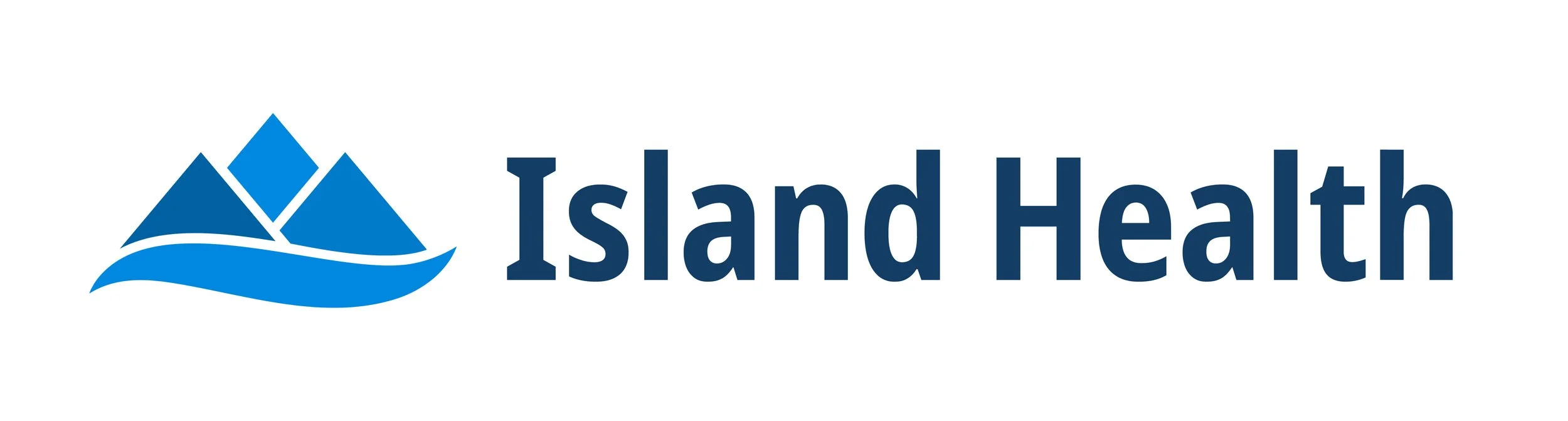
Full-colour horizontal logo

Full-colour visual mark
White stacked logo

Dark blue stacked logo
White horizontal logo

Dark blue horizontal logo
Refined visual mark
Mapping the existing geometry revealed misaligned shapes, uneven spacing, overlaps and unresolved negative space. Rebuilding the mountain and wave elements on a shared grid corrected their spacing and alignment. Adding clear separation between overlapping shapes allowed the same structure to work consistently in full colour and monochrome.
More legible wordmark
The legacy wordmark used disproportionate horizontal compression to fit a fixed width. This distorted the letterforms, reduced spacing and made several characters difficult to distinguish at smaller sizes. The update introduced a typeface with clearer letterforms, improved weight and spacing, and changed the organization’s name from lowercase to title case to match its established usage.
Better contrast, uniform colours
Parts of the legacy visual mark did not provide sufficient contrast against white. The update adjusted each colour to meet the WCAG 3:1 contrast threshold for graphical objects, which made the mark easier to distinguish at smaller sizes and from a distance. It also replaced opacity-based tints with perceptually uniform values from the revised Island Health colour system, creating more consistent relationships between the colours.
✛ Fully responsive logo set
The legacy logo set included only two stacked versions, which could not accommodate the full range of organizational needs. The updated set expands this to nine approved versions. It adds a dark version for light and mid-tone backgrounds, as well as a black version for single-colour printing. Each colour option now includes stacked and horizontal formats, and the standalone visual mark can be used at very small sizes, including as a favicon. Together, these additions allow the logo to adapt across a much wider range of spaces, backgrounds and production methods.
Logo Extensions
02
Once the core logo set was fixed, the next challenge was to address the inconsistent ways departments, care locations, services, tools, programs and public functions combined their names with the Island Health logo. The previous approach used layouts determined mainly by character count. Logo extensions were issued whenever requested, and people also created their own without formal approval. They were then applied inconsistently across signage, websites, social channels, internal tools and communication materials. There were no clear criteria for when they were appropriate, and limited consideration of accessibility or responsiveness. Many extensions were created to give teams a distinct identity, without clear evidence that they helped patients, staff or the public find or understand a service.
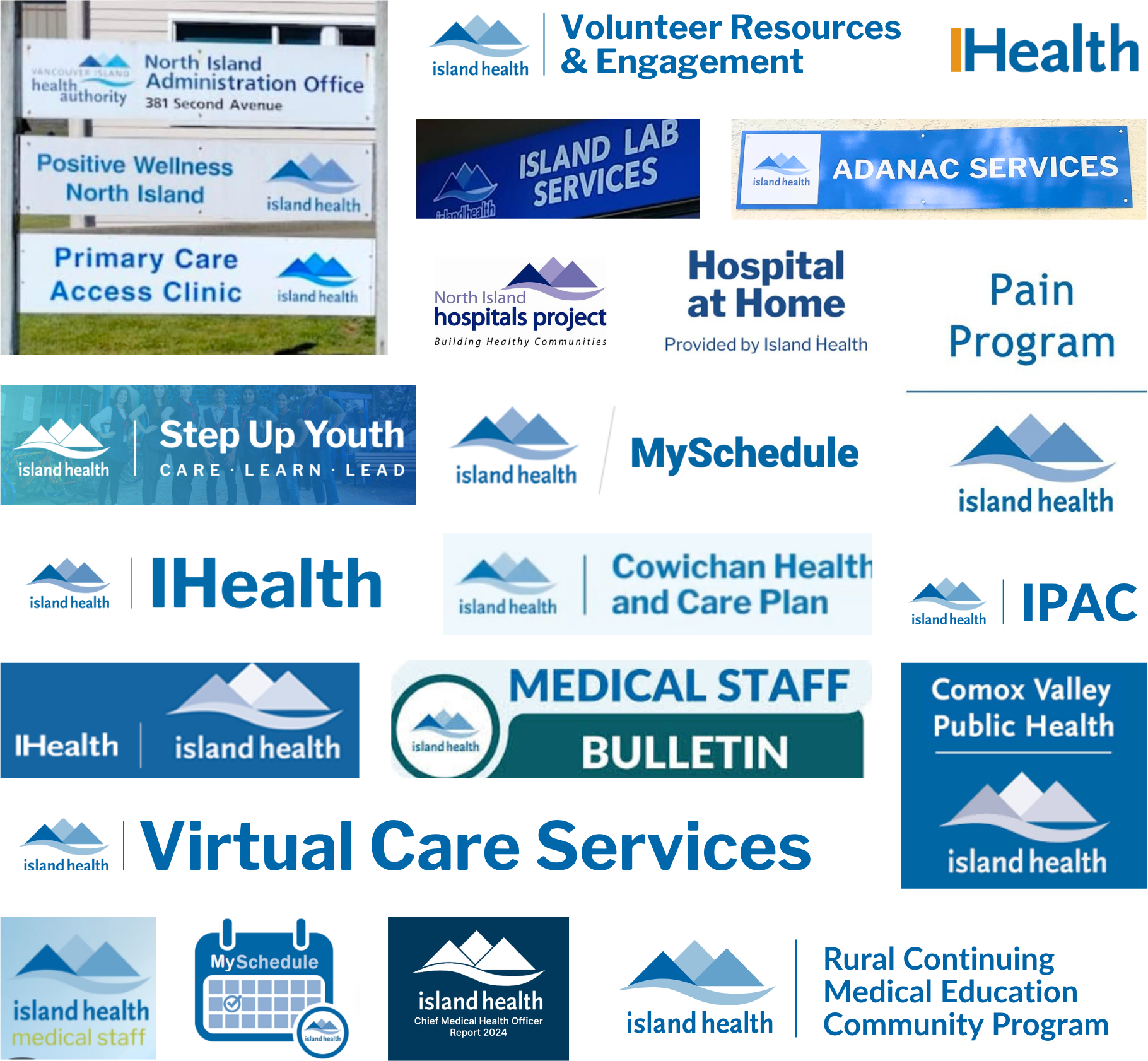
Examples of logo extensions currently used across the Island Health system.
We collected and analyzed examples from across the organization, examining their context, naming, hierarchy, legibility and value to the public. This research established clearer criteria for using logo extensions, defined how different parts of the organization should relate to the core identity, and identified where an extension supported recognition or created unnecessary complexity.
Legacy extensions: audit findings
The previous logo extensions used three horizontal layouts determined by the length of the name. This created a rigid, single-level system that did not adapt well across applications or reflect real organizational relationships.
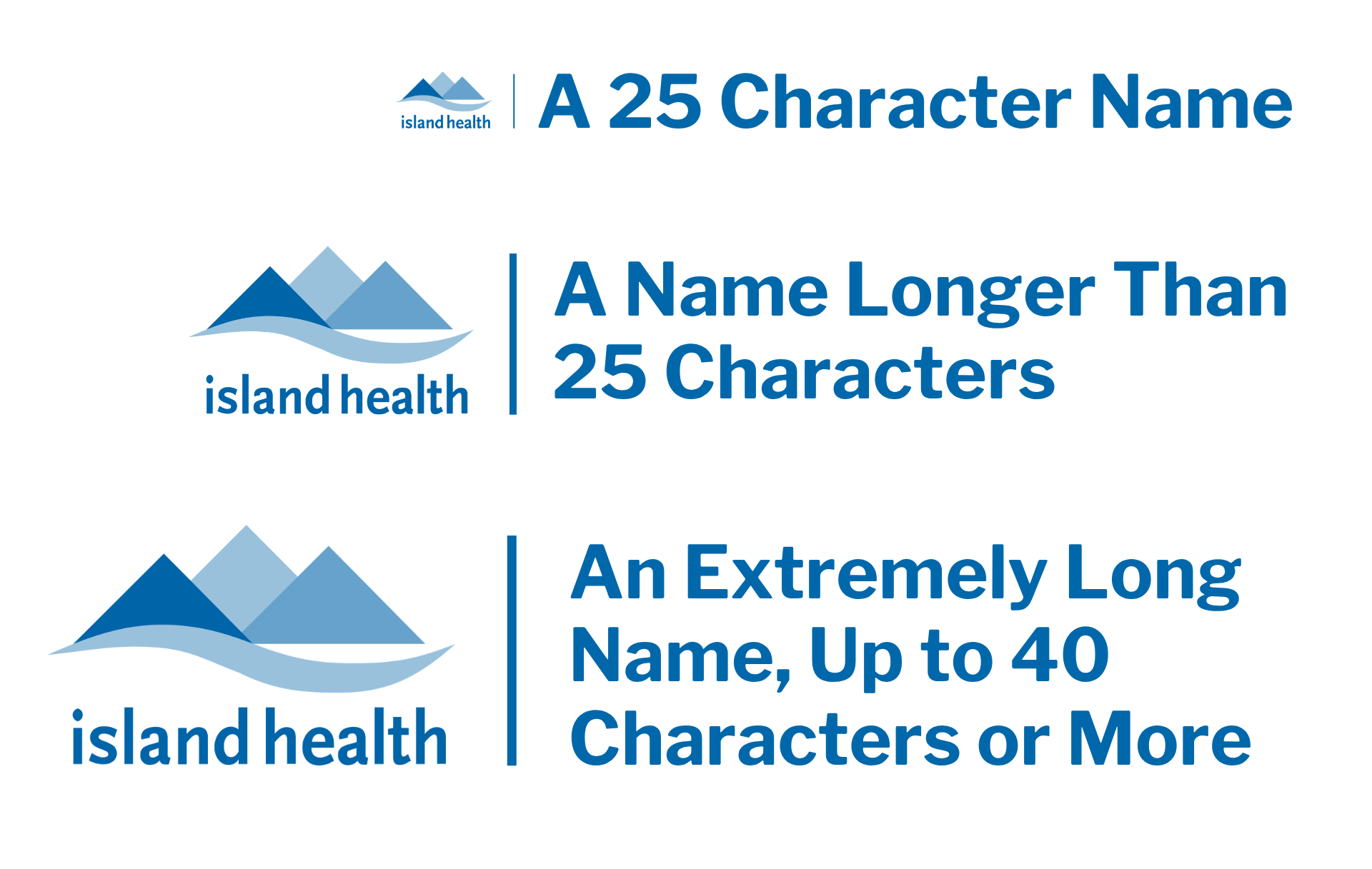
Legacy approach to creating logo extensions
No clear criteria or usage guidance
Teams could request extensions without demonstrating a public or operational need, and some created their own without approval. No guidance explained when or where to use them. Extensions were often used to “brand” materials for individual teams or functions, even when this made the information harder for audiences to understand.
Unsuitable for many applications
A logo extension is a fixed graphic, so the name cannot be searched, selected, translated or read by assistive technology. This makes logo extensions unsuitable for many digital uses, including web pages, emails, documents and presentations. In print, they can become too small to read or recognize. Fine details can also lose clarity in production methods such as embroidery. These limitations make clear rules for their use essential.
No hierarchy or audience focus
Major functions, departments and small programs all received the same type of logo extension, obscuring how they related within Island Health. Internal names and acronyms appeared publicly without enough context, and independent alterations further weakened consistency.
A new purpose-led framework for creating and using logo extensions
The updated framework reserves logo extensions for entities that need distinct public identification. Decisions are based on purpose, audience and context; a two-level hierarchy clarifies organizational relationships and relative prominence within the brand. Where an extension is unnecessary, the core logo is paired with team name rendered in plain editable text. This improves accessibility, gives layouts greater flexibility and prevents unnecessary extensions from accumulating across the system.
When are they issued and required
The new system limits logo extensions to the entities that need them most and introduces a clear two-level hierarchy. This resolves the previous flat structure, where entities of very different scale and public relevance could appear equally prominent, and helps prevent unnecessary logo extensions from being created.
Level 1 — Primary logo extensions
Care locations
Physical locations people visit to get care or access services
- Exterior signage
- All other uses
Portals and functions
Digital portals, tools, public functions or approved communication channels
- Stand-alone websites, tools, portals and social media
- All other uses
Level 2 — Secondary logo extensions
Areas or programs within functions
Specific groups that sit within a larger service, tool or public function
- All uses
New logo extensions
The new logo extensions translate the updated logo into a consistent visual system for endorsed names at both primary and secondary levels. They maintain a clear relationship to the core Island Health identity while giving each approved extension a professionally designed structure that can be applied and maintained over time.
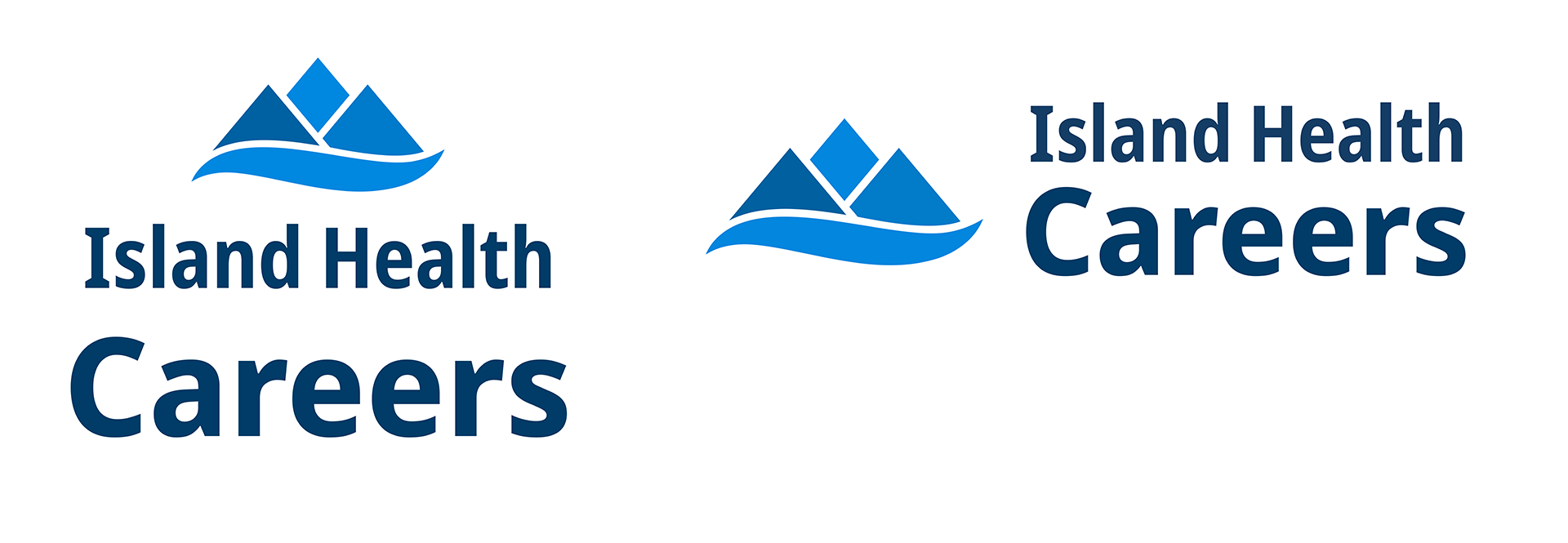
Primary logo extensions examples
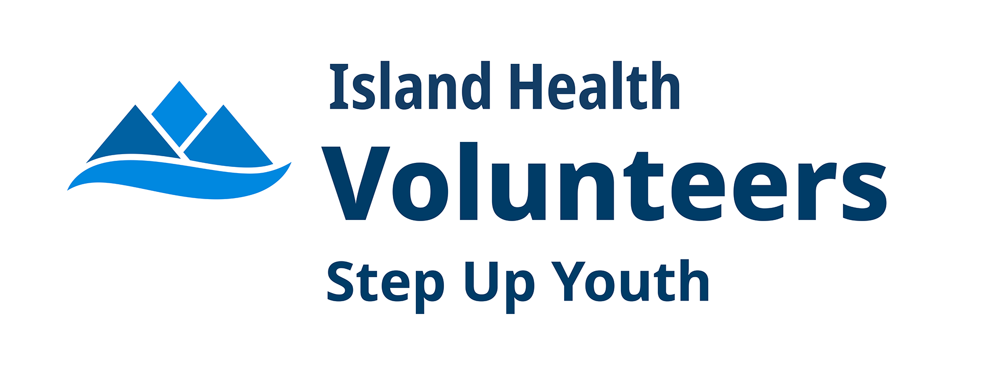
Secondary logo extensions example
Responsive configurations
Approved configurations accommodate different proportions, sizes and applications while preserving hierarchy and legibility.
Built-in accessibility
Each extension inherits the accessibility improvements of the updated logo, including more legible typography and sufficient contrast.
Future-ready system
Because extensions are issued and adapted within a controlled framework, new names and application needs can be resolved professionally without creating inconsistent one-off versions.
Logo system: before and after
03
Island Health public website
The public website was a key application of the updated core logo set. The legacy stacked logo was less legible at smaller sizes while occupying substantial vertical space and constraining the header. Replacing it with the new horizontal version created a more compact, responsive layout with more room for navigation and priority content in the initial viewport.
B E F O R E
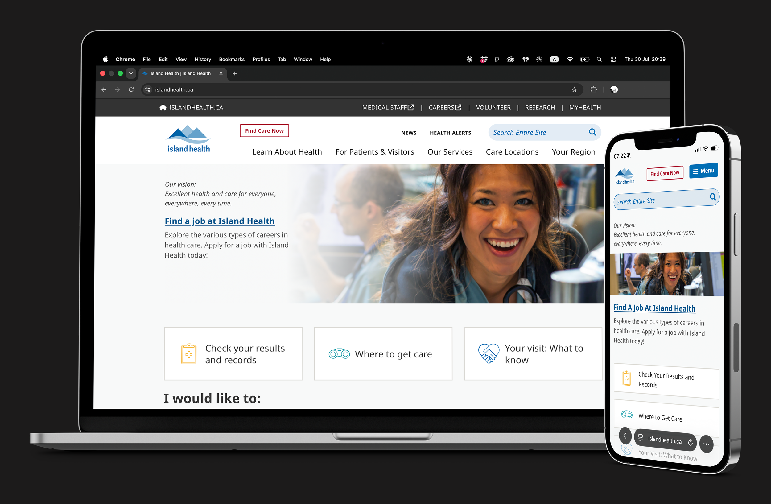
The legacy homepage used the initial viewport inefficiently. Its oversized header and stacked logo reduced the space available for navigation and priority content.
A F T E R
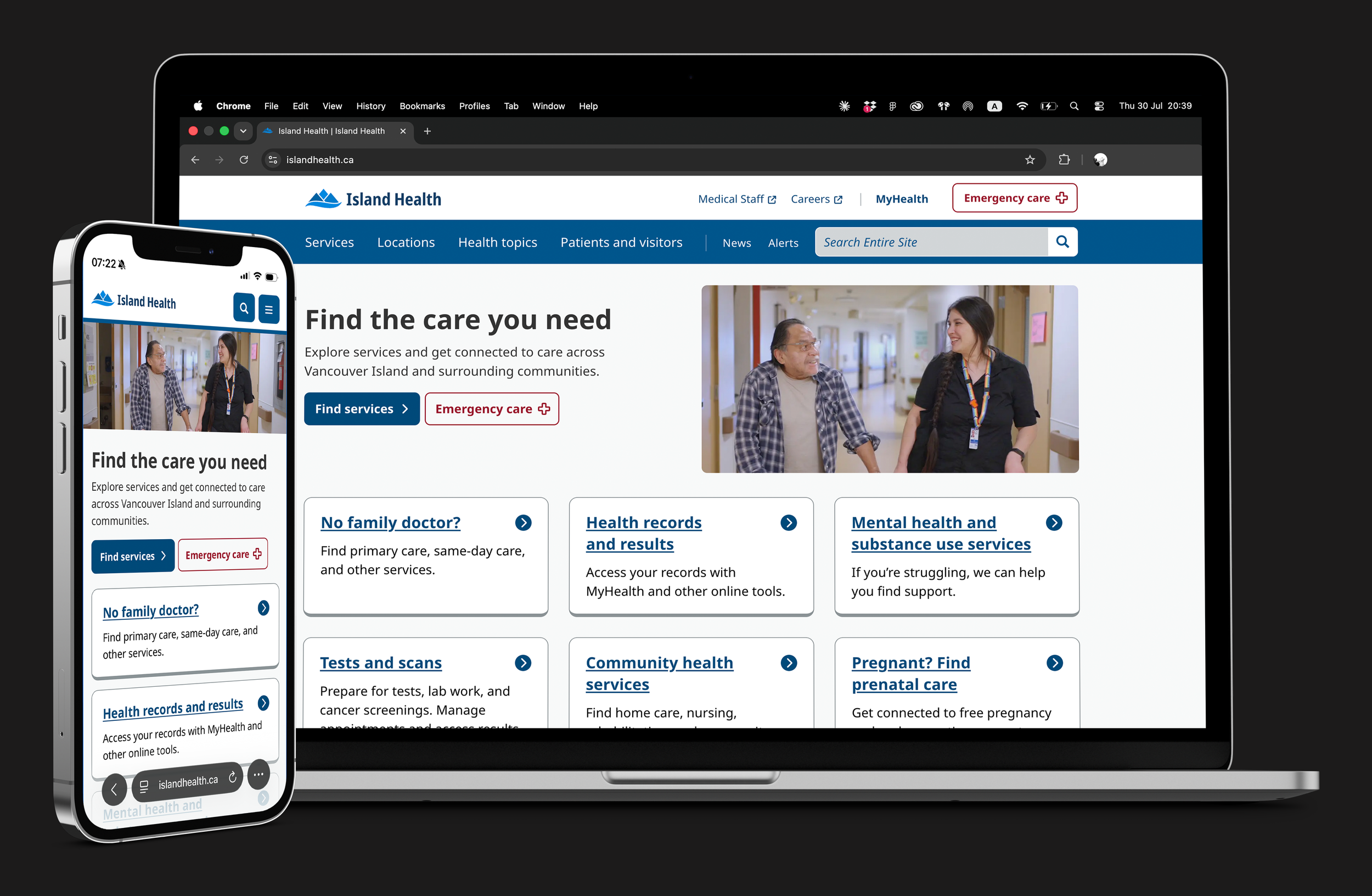
The new homepage introduced the horizontal logo alongside a new digital design system grounded in accessibility. The redesign extended across the homepage structure and components, improving hierarchy, responsiveness and use of the initial viewport.
Exterior signage
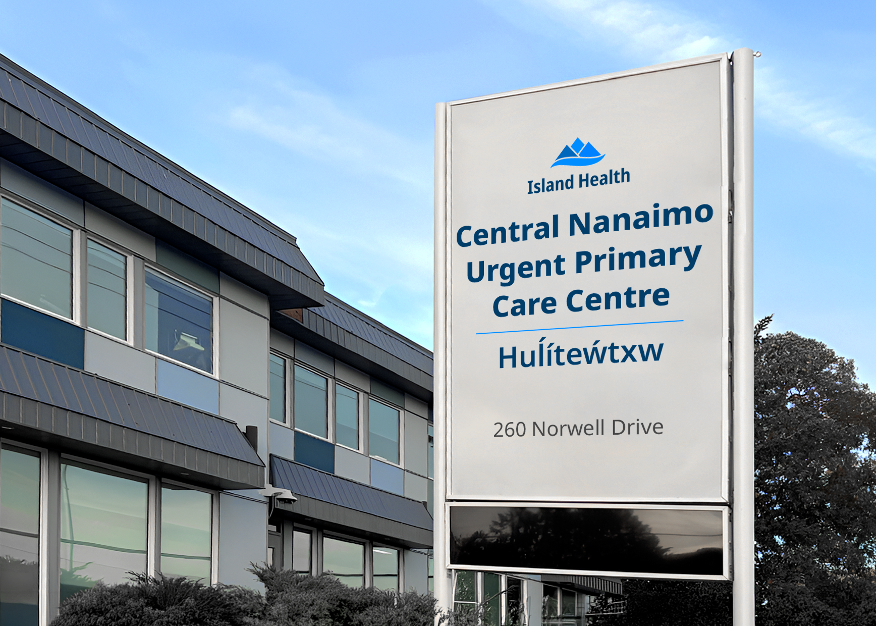
Exterior signage was one of the clearest examples of the problems created by the previous approach to logo extensions. Different locations used inconsistent logo treatments, naming structures, internal terminology and unexplained acronyms. In some cases, multiple approaches appeared at the same location, making facilities and services harder to identify and understand.
B E F O R E
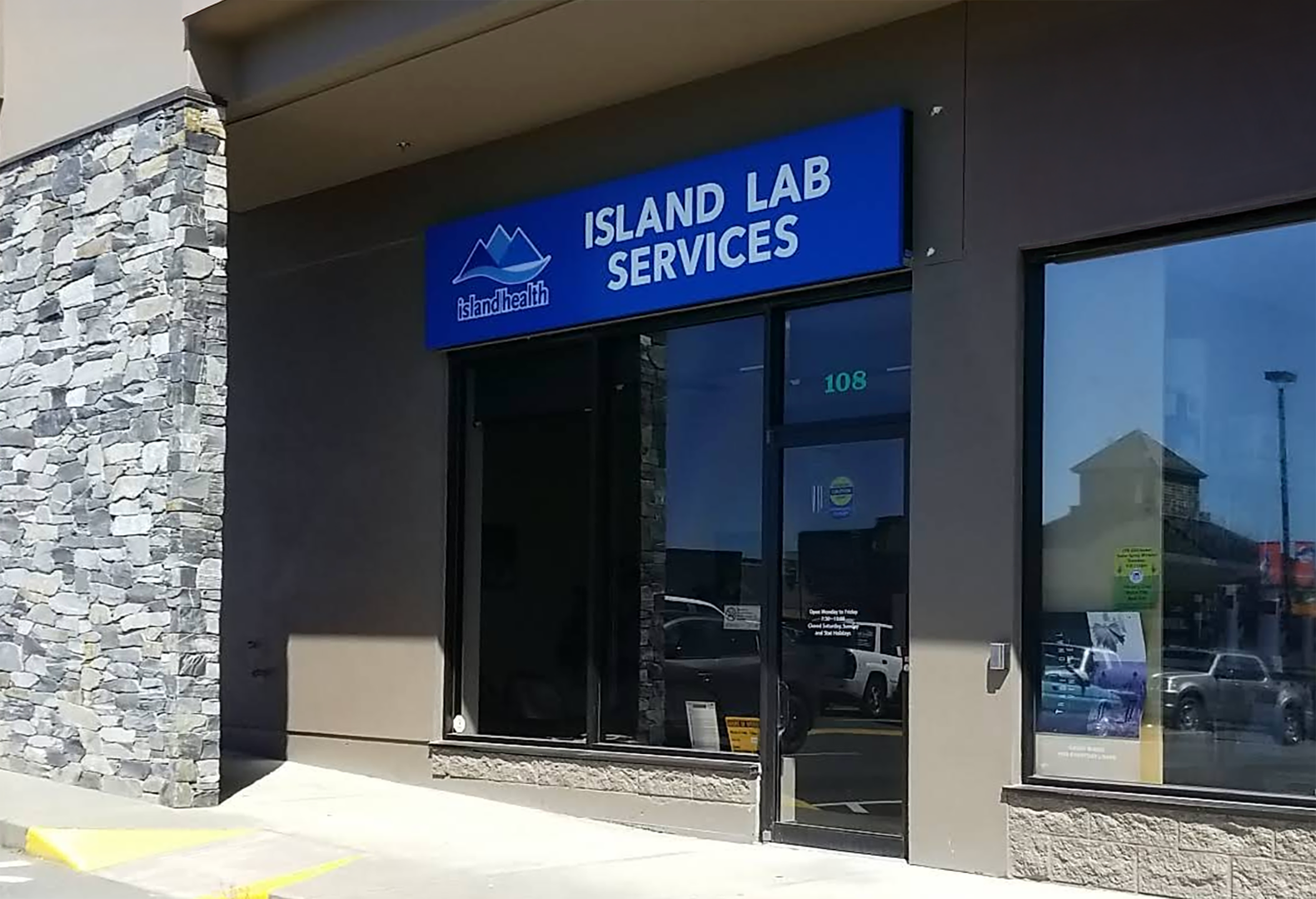
Legacy exterior signage for care locations used arbitrary naming and one-off visual treatments, making the care locations harder to identify as being a part of Island Health.
A F T E R
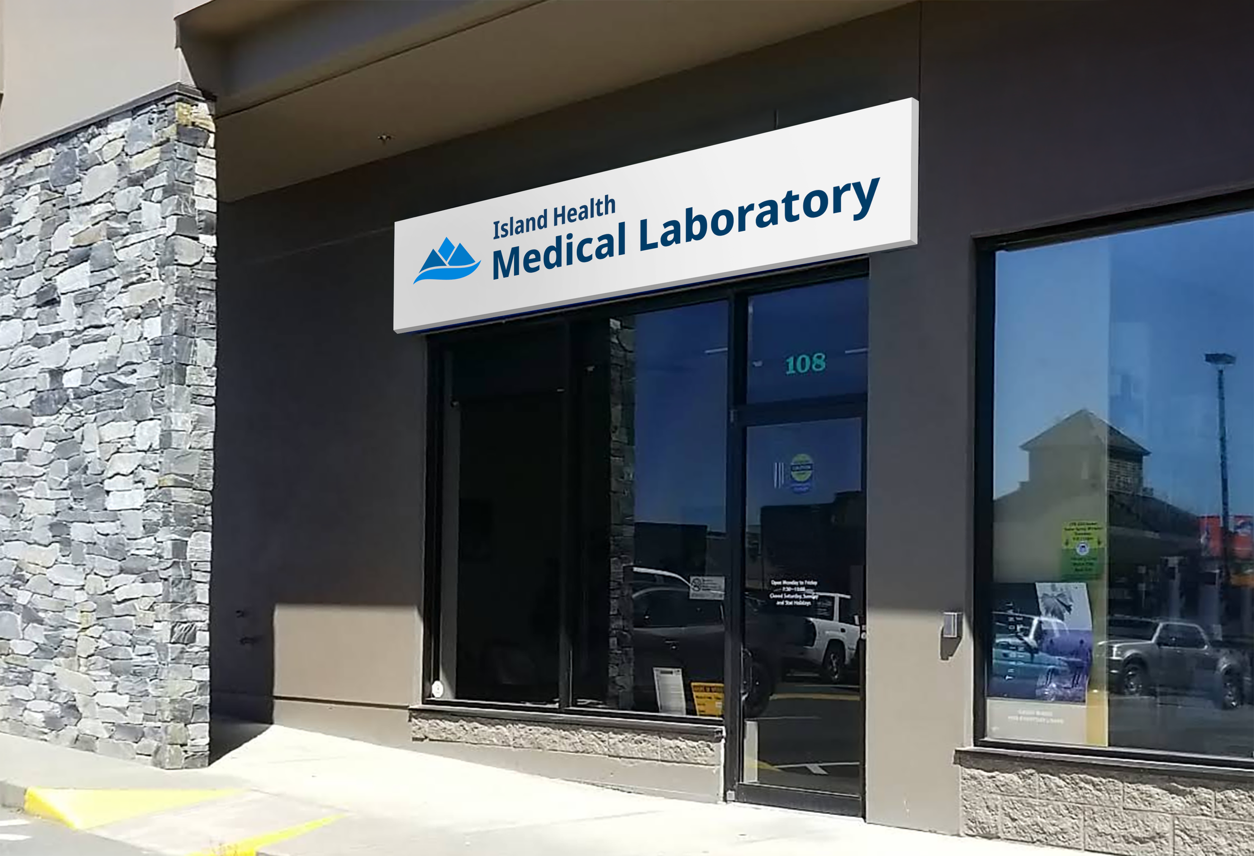
Requiring logo extensions on all new exterior signs and embedding them in the wayfinding standards creates a consistent public presence across locations, strengthening recognition and trust.
Portals and communication channels
Alongside its main public website and social media accounts, Island Health operates specialized portals, tools and websites within its domains, as well as approved social channels for public functions. These resources must be recognizable as official Island Health channels while remaining distinct from the organization’s core channels. Logo extensions are therefore required for stand-alone websites, portals and approved social media accounts.
B E F O R E
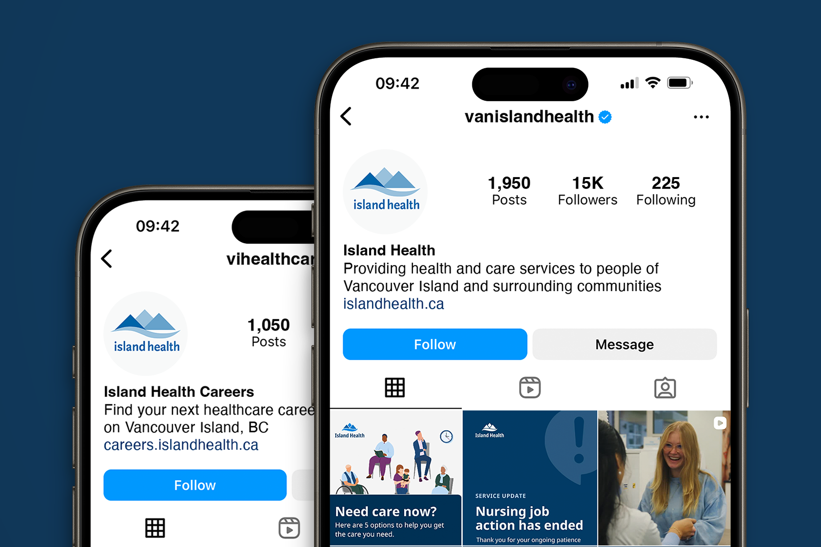
Island Health Careers and the main Island Health Instagram account used the same profile image, creating undifferentiated social media channels that were difficult to identify and distinguish.
A F T E R
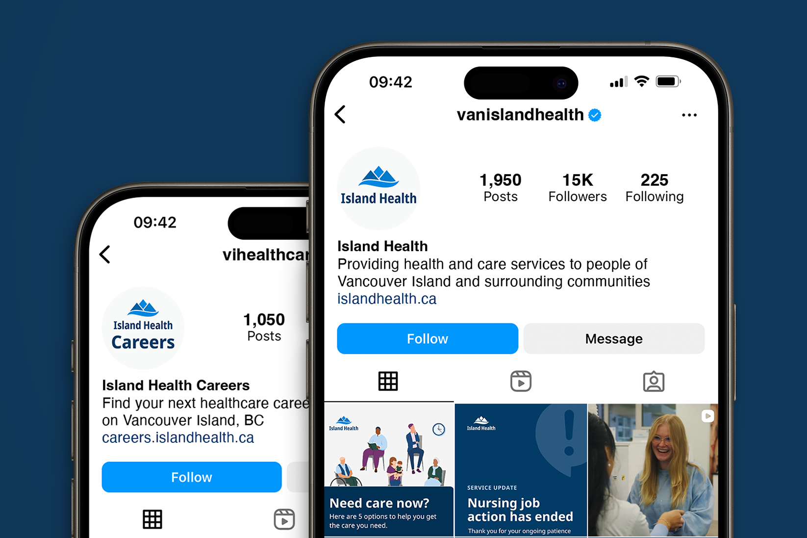
Requiring logo extensions for approved social media channels gives each function a distinct presence while also clearly identifies the channel as part of Island Health.
Internal departments and teams
Many internal departments, programs and teams previously used logo extensions as their primary identifier across internal web pages, newsletters, documents and team materials. These extensions were often modified locally and applied inconsistently, while acronyms and unclear naming made them difficult to understand. Because names were embedded in images, missing alt text could also make them inaccessible to people using assistive technology.
B E F O R E
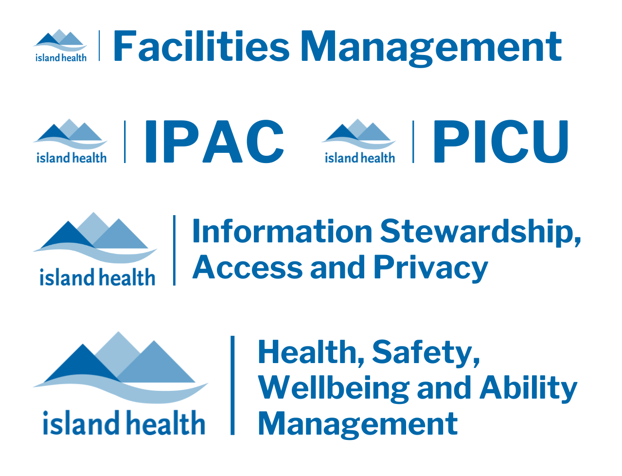
Stand-alone logo extensions were widely used by internal teams and were frequently altered or applied without consistent standards, creating unclear and fragmented identification across the organization.
A F T E R
The new framework no longer issues logo extensions to internal departments, programs or teams. They use the core Island Health logo and present their names as plain, editable text, improving consistency, clarity and accessibility.
Implementation and governance
04
Accessible and on brand templates
Templates were essential to embedding the updated logo system into everyday communication. They translated the new standards into ready-to-use layouts, combining the appropriate core logo versions, approved typography and colours, and flexible space for department or program names as editable text. This reduced the need for staff to interpret, rebuild or modify brand elements independently and made accessible materials easier to produce across the organization.
B E F O R E
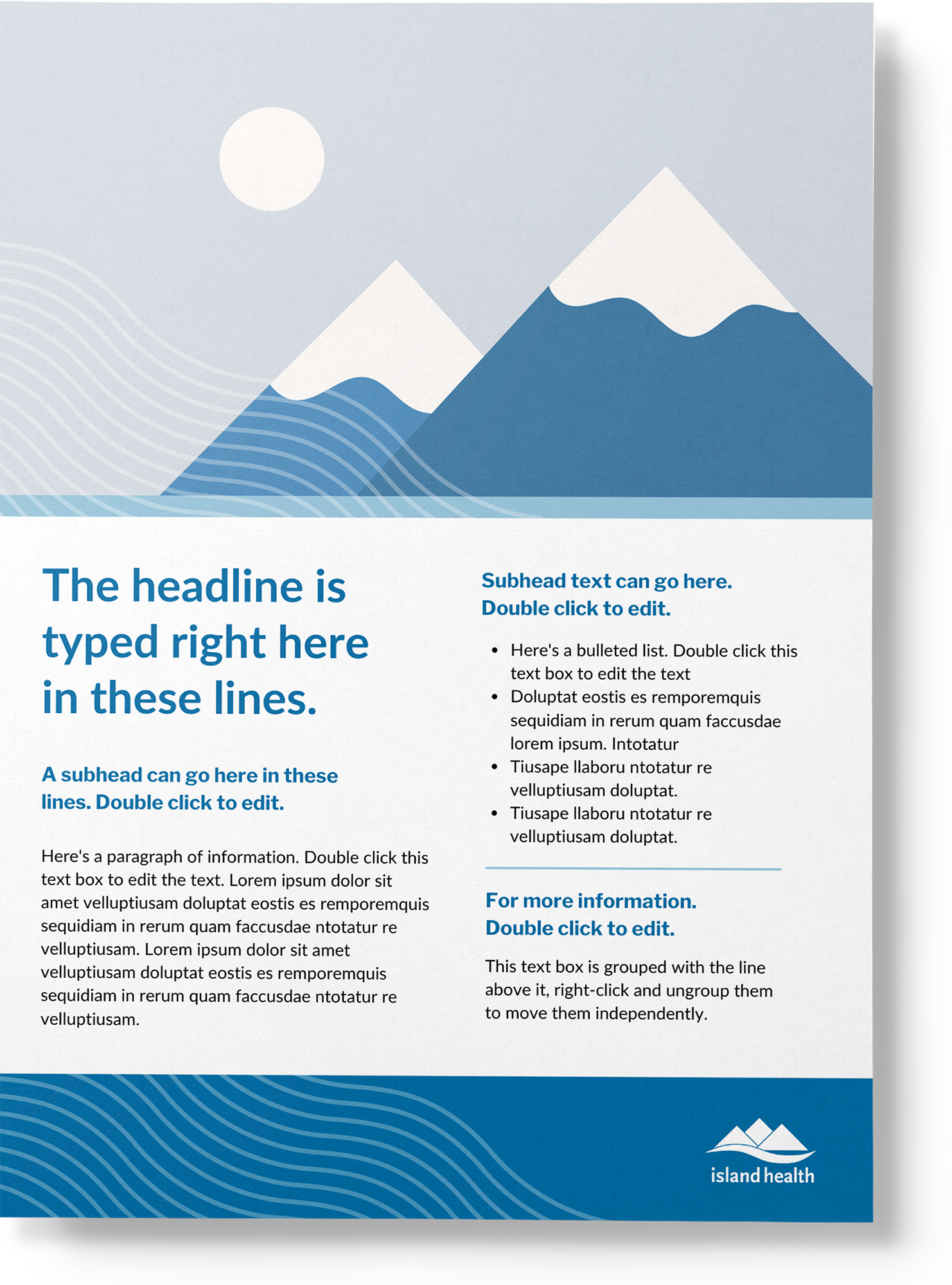
Legacy templates used the previous logo and relied on excessive decoration, small text, low-contrast elements and weak information hierarchy, making materials difficult to scan and navigate.
A F T E R
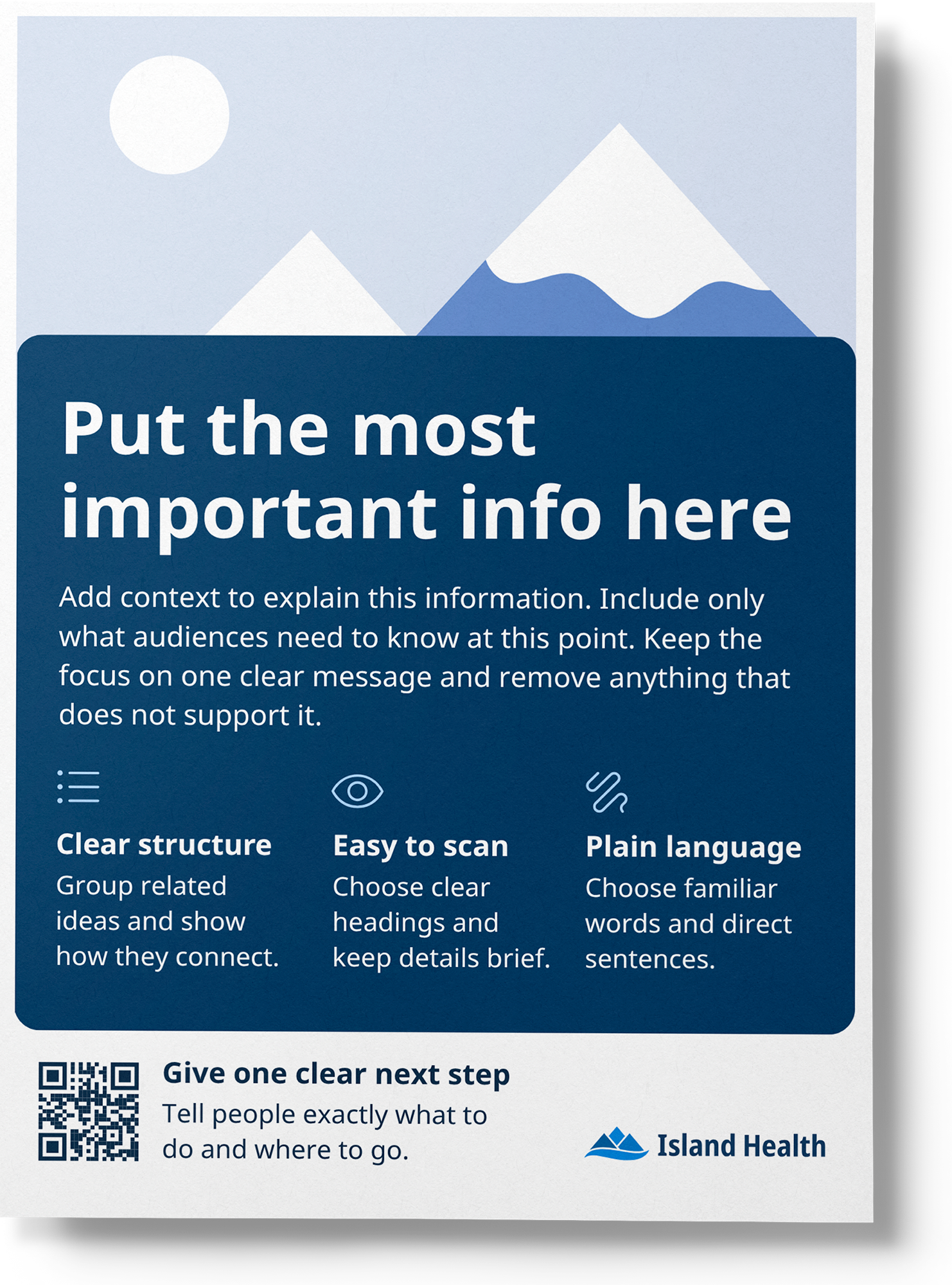
The new templates use the appropriate version of the updated logo, accessible typography and colour combinations, and a clear content hierarchy. Built-in guidance helps staff organize information and create materials that are clear and easy to follow.
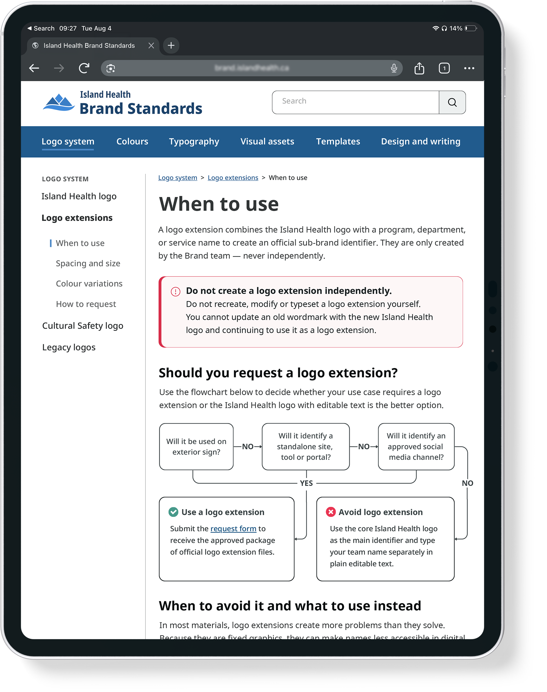
Brand standards
The Brand Standards website brings the updated visual system, usage rules and approved assets into one central reference. Clear guidance, practical examples and downloadable resources help staff apply the brand consistently across digital, print and physical environments. Defined governance and request processes prevent unauthorized modifications and allow the system to evolve in a controlled way.