
Colour System Redesign: Vancouver Island Health Authority
Client: Island Health (Vancouver Island Health Authority)
Design problem: The existing colour palette lacked the accessibility, clarity, and structure needed to support a functional and inclusive visual identity for the health authority. It did not meet the usability standards required for digital and physical environments, nor did it reflect the specific needs of the healthcare authority.
Key challenges: Perceptual inconsistencies, poor contrast ratios, and limited support for colourblind users making it challenging to create an accessible, standards-compliant design. The system didn’t meet WCAG contrast requirements or support the clear use of colour to communicate brand voice. It also lacked flexibility across digital, print, and physical environments. At the same time, preserving continuity with legacy materials in active use across the organization remained essential.
Design solution: Redesigned and expanded the Island Health colour palette using the OKHSL model to create perceptually uniform ramps that enhance accessibility and usability. The updated system evolves the palette into a scalable, structured colour system with consistent naming, accessible values, and visual continuity with the original hues.
My role: Led the research, development, and implementation of a new colour system. Applied it to key deliverables, including the Organizational Strategic Framework and the Emergency Codes Response Guide, ensuring accessibility and clarity across both digital and print contexts.
Collaborators: Stephen Mullally, Communications Designer — contributed to defining colour ramps structure and conducting accessibility testing.
CUrrent palette
Problems in the Current Colour Palette
Structural Issues
Arbitrary Grouping & Naming
Tints, base colours, and neutrals are mixed, making it difficult to understand the intended application. Naming is inconsistent, which makes it challenging to communicate brand intent and apply the colours consistently across platforms.
No Scalable Colour Ramps
Most colours don’t come with proper tints or shades. Instead, tints of blue are created by adjusting opacity, which leads to washed-out variations that feel unrelated to the base hue.
Implementation Gaps
Missing Core Functional Colours
No clear system for success, error, or warning states. Colours like green, red, and yellow/orange are either missing or undefined. Basic neutrals like black and grey are also absent or miscategorized.
Not Aligned with Health Sector Needs
The palette doesn’t support the practical realities of a Health Authority. It falls short in areas like signage, wayfinding, clinical alerts, and facility design, where colour needs to perform a function.
Usability & Accessibility
Lack of Accessible & Inclusive Combinations
Not enough usable combinations that meet accessibility standards or support colour-blind users. This limits flexibility and weakens the overall brand voice.
Poor Digital Suitability
No contrast, scale or adaptability needed for digital platforms. The current colour palette is difficult to apply consistently across web, mobile, and UI design.
UPdated colour palette* These are interim names currently in use while final names are being developed.
Solutions in the Updated Palette
Perceptually Uniform Colour Scales
Each base hue includes a full range of variations generated using the OKHSL colour model. This ensures even, predictable shifts in lightness and saturation, making the application more consistent and reducing unpredictability.
Support for Functional Colours & Code Systems
Key colours like blue, red, green, and orange are named to suggest function, supporting clear communication across clinical and public-facing contexts. The system is also flexible enough to accommodate emergency colour codes used in hospitals.
Scalable and Stable Naming
The OKHSL model allows for additional variations to be introduced without disrupting naming or structure. This makes the palette easily expandable and future-proof while keeping logic and usability intact.
Locally-Informed Supplementary Colours
A set of supplementary colours is currently undergoing a naming process in consultation with local Indigenous communities. This aims to reflect the local context and cultural significance of the territories served by Island Health, ensuring the palette is respectful and grounded in place.
Built-In Accessibility
Every colour ramp is designed to support accessible contrast within each hue and across combinations. Designers can confidently create WCAG-compliant pairings for a wide range of users and environments.
Cross-Platform Consistency
The palette includes guidance for application across digital, print, and environmental contexts. This supports the accessible design, reinforces the visual identity, and ensures materials feel cohesive across platforms.
The updated colours look the same but perform better.
The updated colour system maintains close visual alignment with the original Island Health colour palette. This supports continuity across existing materials and reduces disruption for teams already using the system.
Most colours in the new palette remain visually similar to their earlier versions. The only significant shift is in the aqua and teal range, which has been adjusted to a green that meets contrast standards and is distinguishable from red and orange in colourblind scenarios.
This change enhances accessibility in both digital and physical environments, including screen interfaces and wayfinding applications, while preserving the core identity.
Image: Initial vs. Updated Colours

The new ramps are perceptually uniform and accessible.
The new colour ramps are built using the OKHSL colour space, ensuring perceptual uniformity across each hue. Steps between values are visually consistent, making the palette easy to scale and modify without breaking structure. The OKHSL model allows in-between values to be added without disrupting the naming system.
To meet accessibility standards, overly bright colours that fail contrast tests have been removed. The palette now supports accessible combinations across digital and print applications.
Image: Progression of the blue ramp

Designed for clinical use with real-world accessibility.
The new colour system enables colourblind-friendly design across all major types of colour vision deficiency: deuteranopia, protanopia, and tritanopia. It ensures that colours remain distinct and functional in scenarios where people may not perceive red, green, or blue hues accurately. It also supports clinical use, including acute care emergency codes—a standardized set of colour-based alerts used in hospitals.
This approach helps ensure that critical visual cues remain accessible to all, reinforcing safety and clarity across Island Health’s facilities.
Image: Colour representations of standard hospital emergency codes, shown in variations that account for red-green and blue-yellow colour vision deficiencies.

Naming is informed by a sense of place and responsibility.
Vancouver Island is the unceded territory of many Indigenous Nations. Island Health operates on these lands and is committed to reconciliation, in alignment with provincial direction and organizational values. As part of this commitment, we are exploring ways to inform colour naming through Indigenous ways of seeing and relating to place. While primary colours like blue, green, orange, and red serve functional roles, other colours offer an opportunity to reflect the land more meaningfully.
We are planning to engage with Indigenous voices to guide this work and ensure it reflects respect, relevance, and responsibility.
Image: Visual references collected from survey participants, showing plants, animals, and natural phenomena associated with specific colours.

applicationA scalable colour system that supports care, communication, and access
From emergency signage to health education materials, visual communication plays a key role in helping patients navigate care safely and confidently. The new colour system is designed to support this experience ensuring information is clear, consistent, and accessible to everyone, including those with visual impairments or temporary or permanent disabilities.
The system is flexible and supports a wide range of applications, from digital interfaces to printed guides, across Island Health’s many teams and facilities. Its structure makes accessibility straightforward, while built-in contrast and naming conventions reduce the risk of misuse.
As care continues to evolve, so can this system. New variations can be added without disrupting visual coherence or accessibility standards. With space to reflect Indigenous ways of seeing, the system also holds the potential to better connect care to place, culture, and community.
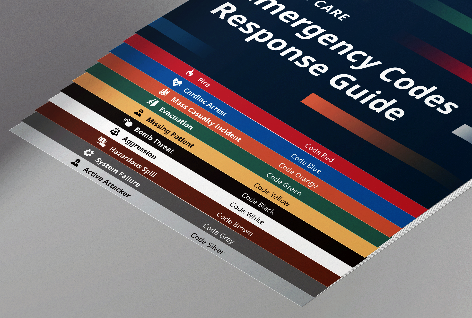
Emergency Codes Response Guide
Hospitals use a standardized system of colour-coded alerts—known as emergency codes—to signal critical events like cardiac arrest (Code Blue), fire (Code Red), or evacuation (Code Green). When a code is called, staff must respond immediately, and their role-specific actions vary depending on the type of emergency.
The Emergency Codes Response Guide was designed to support this process. It clearly outlines the response steps for each code, helping staff navigate high-pressure situations with clarity and speed.
Built using the updated Island Health colour system, the guide ensures accessible, colourblind-friendly communication. Each code is paired with a distinct hue that remains legible across a range of visual abilities. High-contrast text and structured layouts further support fast recognition and ease of use. In a setting where delays can cost lives, this tool helps make emergency communication faster, clearer, and more inclusive.

Colour-coded Strategic Framework communication system
This colour-coded system was developed to support how Island Health communicates its strategic priorities across teams and departments. Built around the Quadruple Aim model — which focuses on improving patient and family experience, provider experience, population health, and system efficiency — the framework offers a visual structure for aligning work across the organization.
Designed for flexibility, this system can be used in multiple formats, including presentations, posters, and planning materials. It also allows teams to zoom in on specific elements of the strategic roadmap while maintaining a clear connection to the broader vision. This is achieved through consistent colour coding: each strategic pillar is represented by a dedicated colour used across headings, icons, and supporting visuals. When a particular pillar is in focus, its colour anchors it back to the full framework, reinforcing the sense of a unified system.
By combining typographic hierarchy with accessible colour combinations, the design ensures that strategic priorities are not only easier to understand and recall but also more inclusive and adaptable for a wide range of audiences and contexts.


