Packaging for organic grains
Client: OVIS, LLC, a producer and packager of organic grains and other foods based in Rivne, Ukraine.
Project dates: 2010–2011
Design objective: develop a distinctive packaging system for a range of everyday organic grains and pulses that gives OVIS a strong brand presence and connects the products to their Ukrainian origin.
Key challenge: create a contemporary and recognizable design within the constraints of limited-colour flexographic printing on paper packaging. The system needed to keep the OVIS name prominent while giving the range a visual language familiar and relevant to Ukrainian consumers.
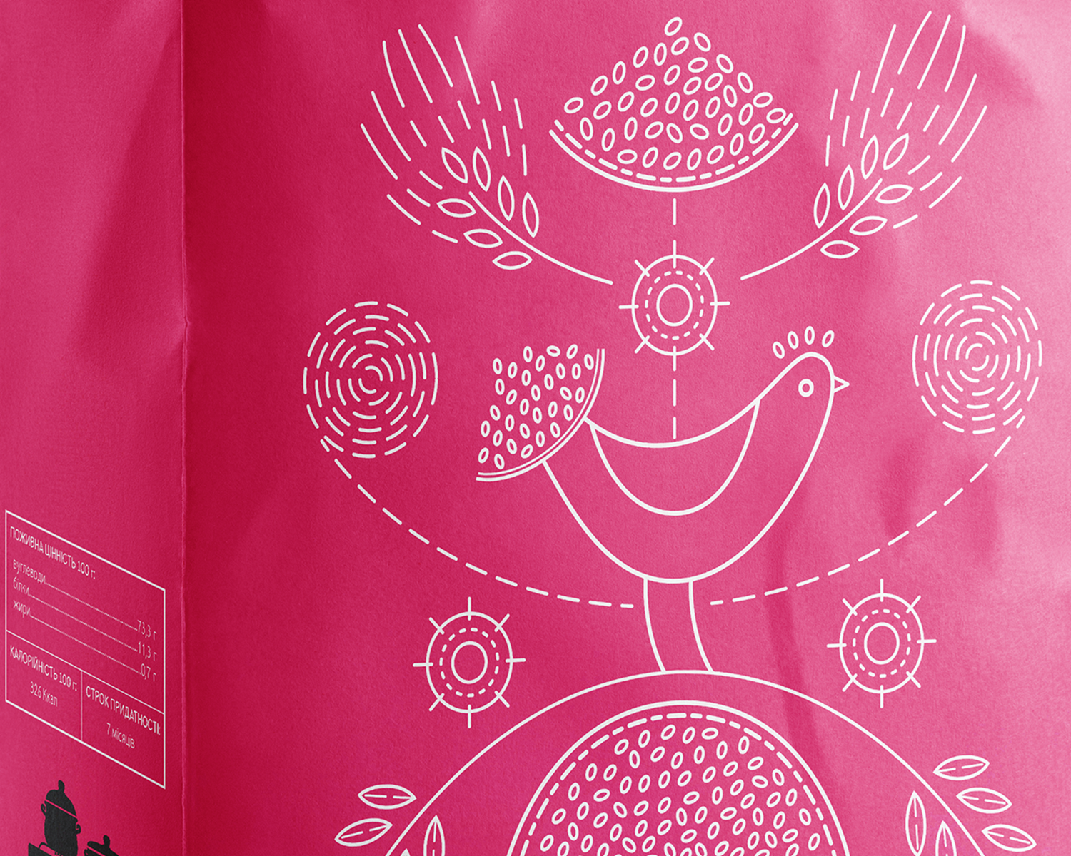
Design solution: a contemporary interpretation of the Tree of Life, a recurring motif in Ukrainian decorative arts and embroidery. Each symmetrical composition combines crops, plants and birds, with the illustration informed by the way each grain or pulse grows. Simplified forms and a restrained colour palette allow the artwork to reproduce effectively through flexographic printing while creating a consistent system across the range.
My role: concept development, art direction, and packaging design. I developed the visual direction, directed the illustration process, and adapted and finalized the artwork across the packaging range.
Illustration: Yevhenia Haidamaka collaborated on the early illustration development and created artwork that formed the basis of the final packaging designs.
Research and visual direction
01
The product range consists largely of grains and other staple crops that have been grown and eaten in Ukraine for generations. Their long presence in everyday life and agricultural traditions became the starting point for the packaging. I wanted the visual direction to reflect this connection through imagery that would feel culturally familiar to Ukrainian consumers.
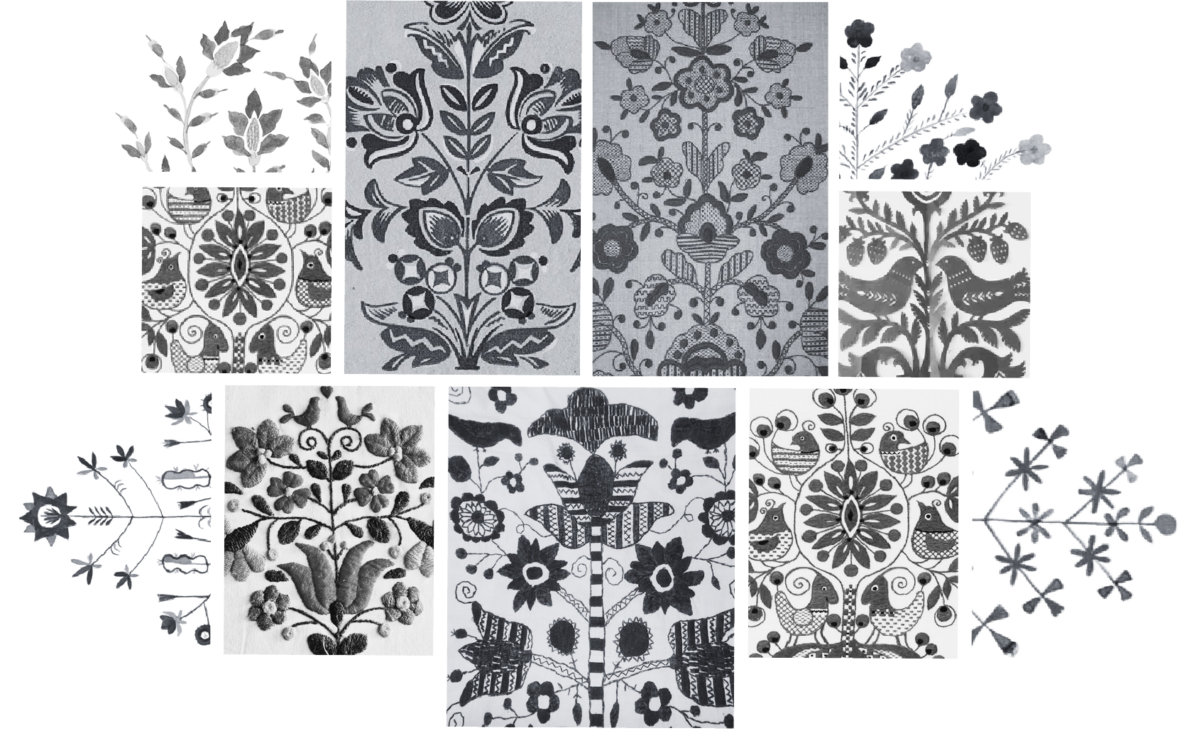
Research into Ukrainian decorative arts led to the Tree of Life, a recurring motif found across embroidery, decorative painting, ceramics, pysanky and other forms of folk art. Typically organized around a central plant form, these compositions combine branches, flowers, leaves, birds and other natural elements and are associated with life, growth and continuity.
I developed an approach to reinterpreting the traditional Tree of Life across the packaging range through the products themselves. Each package has its own composition built around the crop it contains, combined with birds, plants and abstract forms drawn from the visual language of the tradition. This creates a clear connection to Ukrainian cultural heritage and a consistent illustration style across the full product range.
Concept development
02
The Tree of Life concept was developed through a series of sketches exploring composition, symmetry and different ways of incorporating each crop into the illustration while maintaining a consistent visual language across the range. Preliminary sketches for split yellow peas, millet and semolina explored how the same concept could be adapted to products with very different forms and characteristics. I worked with illustrator Yevhenia Haidamaka to define the visual direction and develop the initial artwork, refining the balance, shapes and recurring elements as the packaging system took form.
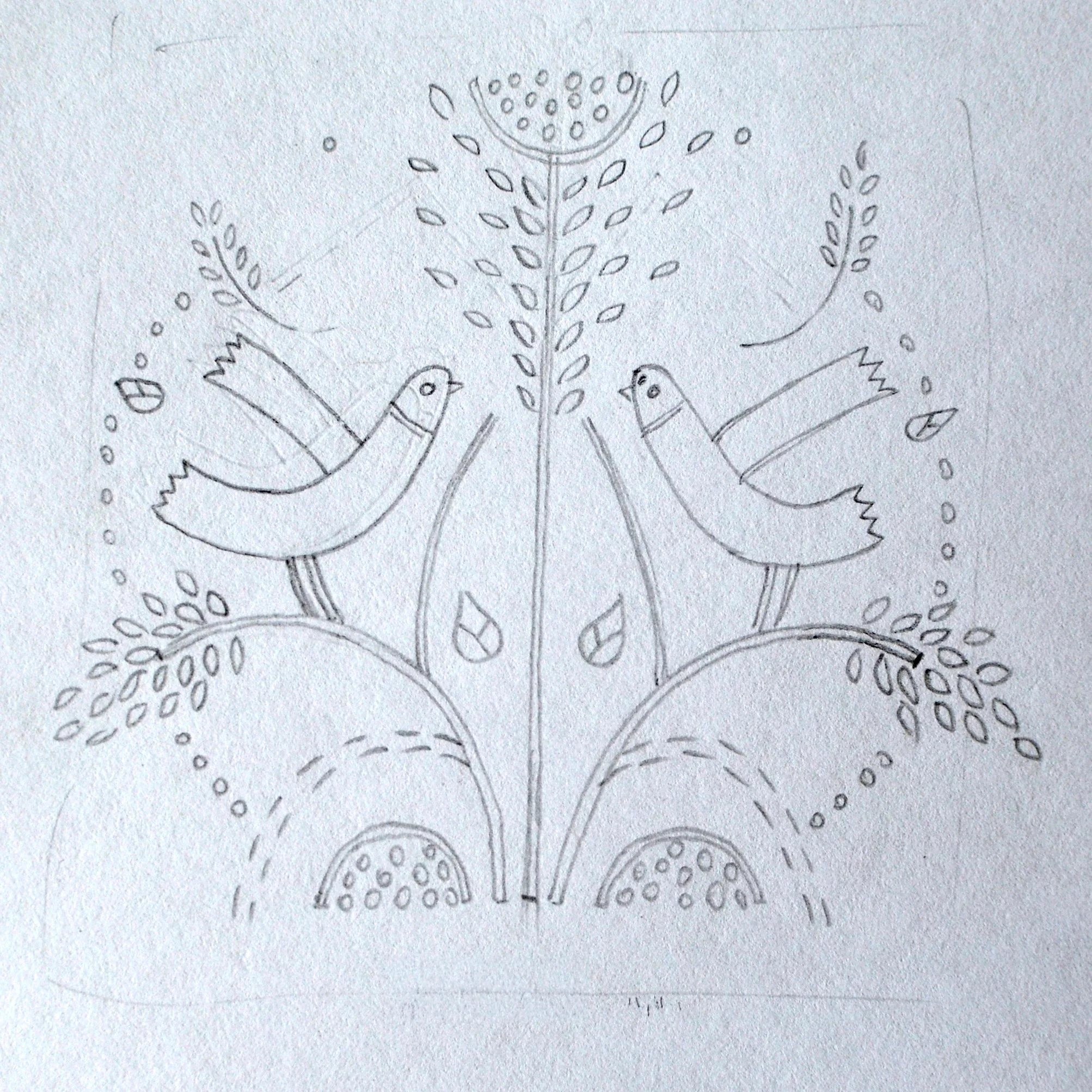
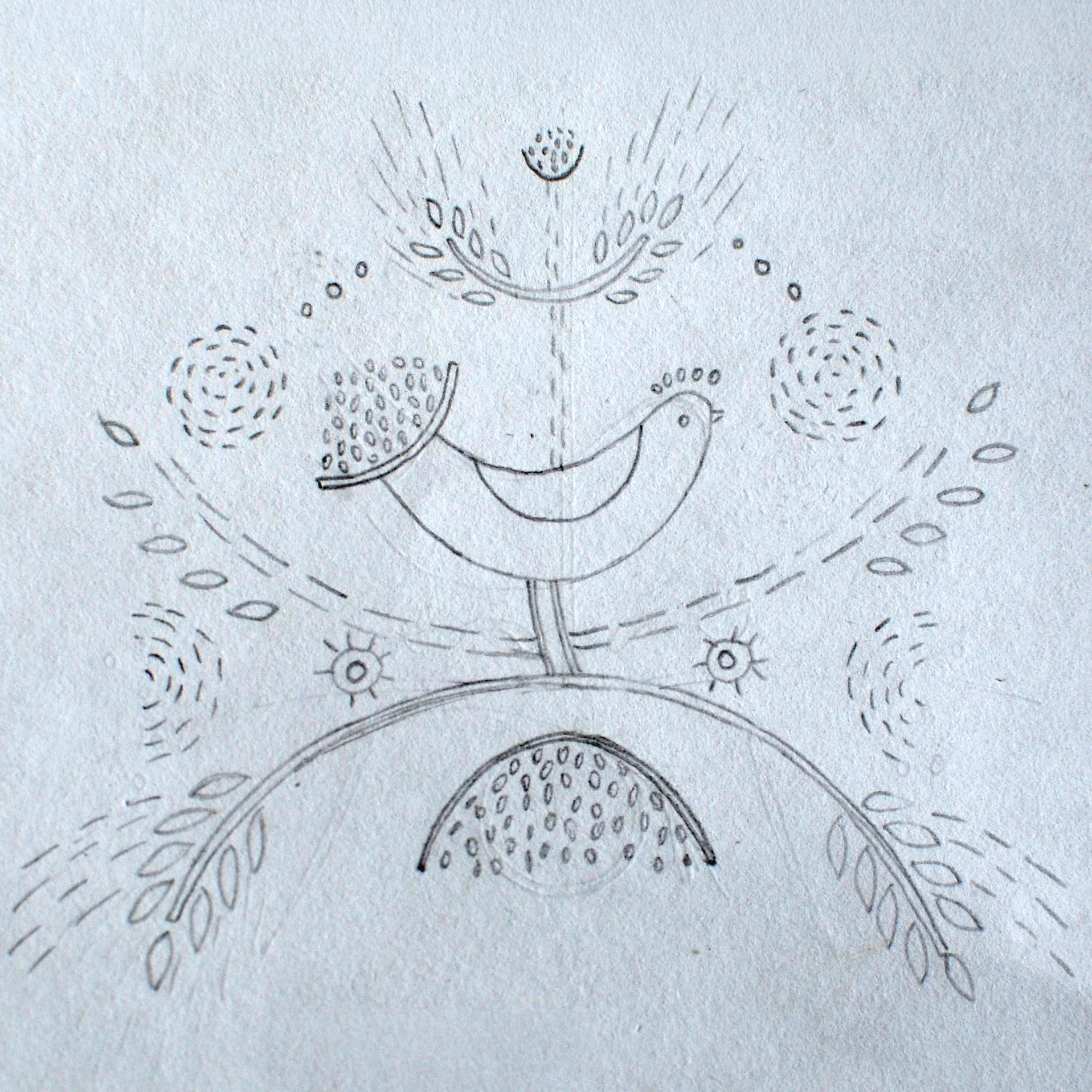
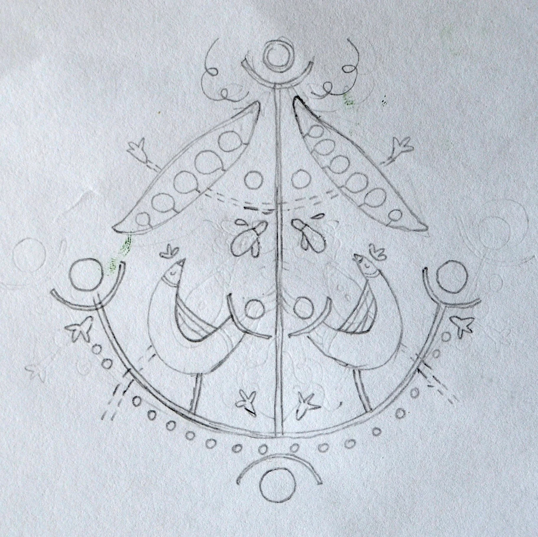
The preliminary pencil sketches were later developed into finished illustrations and adapted for two-colour flexographic printing on paper. The artwork was traced, refined and composed within the packaging layout, with adjustments made where needed to suit the printing process. The illustrations remain deliberately minimal, supporting the product information without dominating the package and helping each product stay clear and easy to identify.
Final packaging system
03
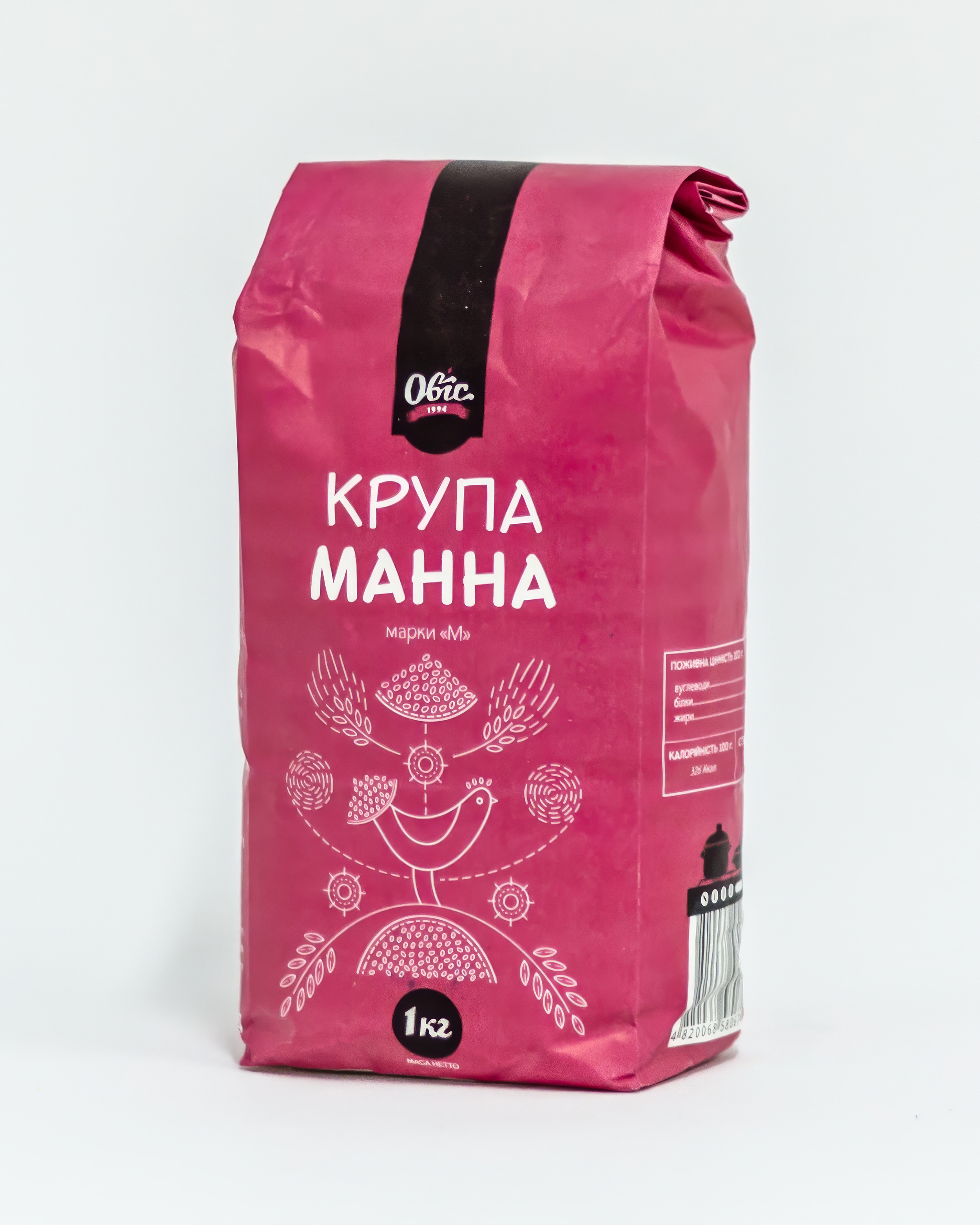
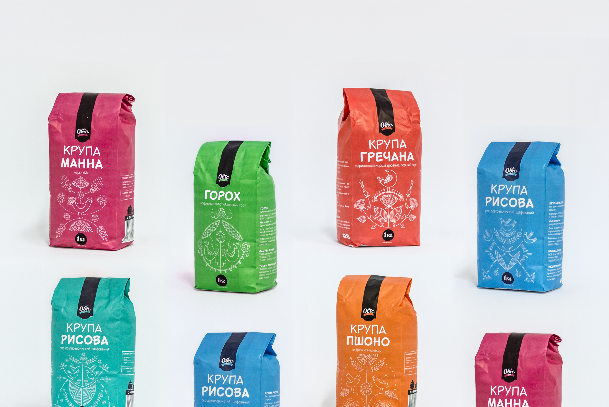
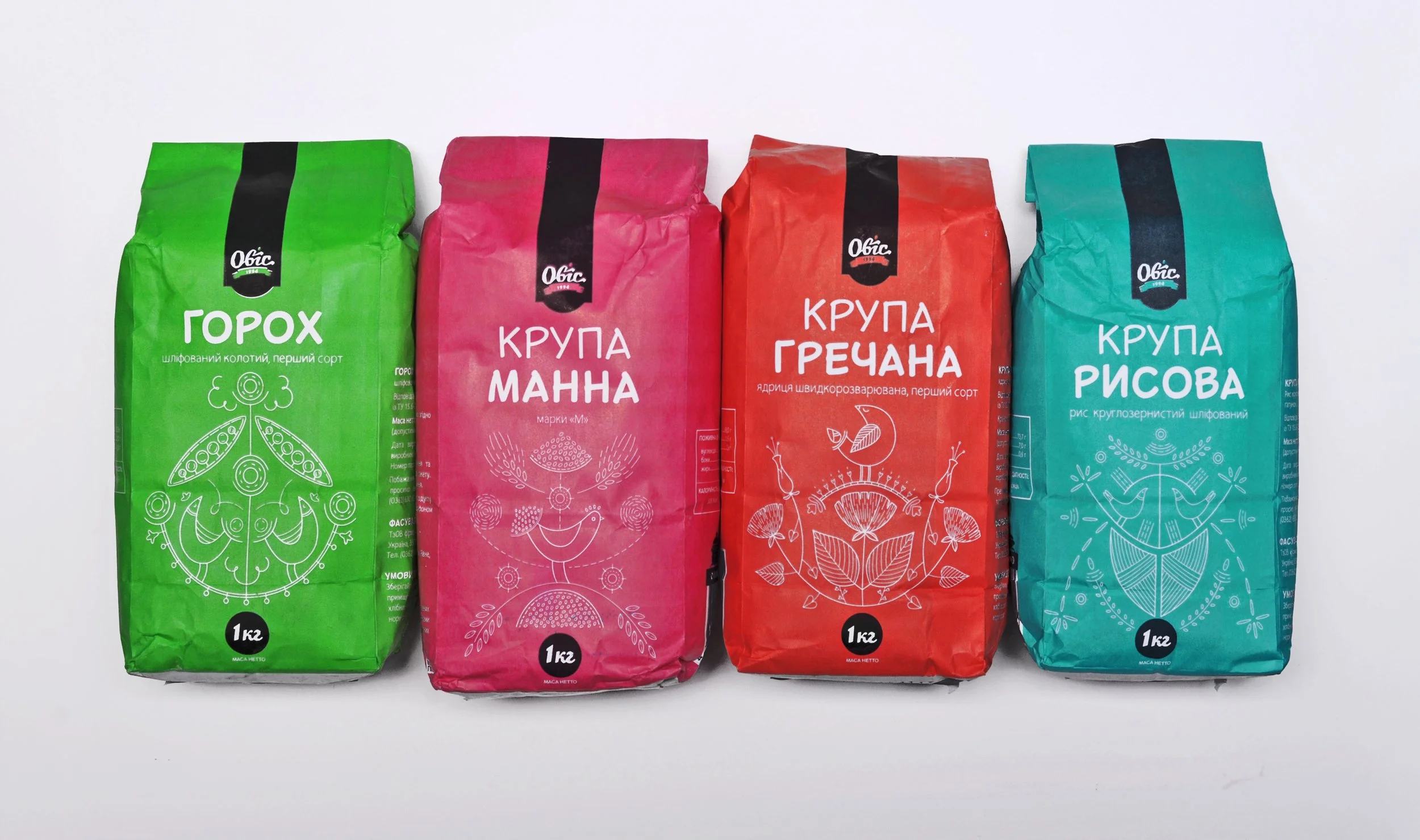
The final packaging uses a clear, consistent hierarchy across the full range. The product name is the largest element on the front panel, with the 1 kg weight displayed prominently and the OVIS brand clearly identified. Illustration occupies the central area as a decorative element, giving each product its own visual identity without competing with essential information. Each package is assigned a distinct colour for quick recognition across the range, while the overall layout and illustration style remain consistent.
The packaging was also structured to accommodate the mandatory product information required on food packaging in Ukraine, including product identification, quantity and supporting consumer information.
Buckwheat
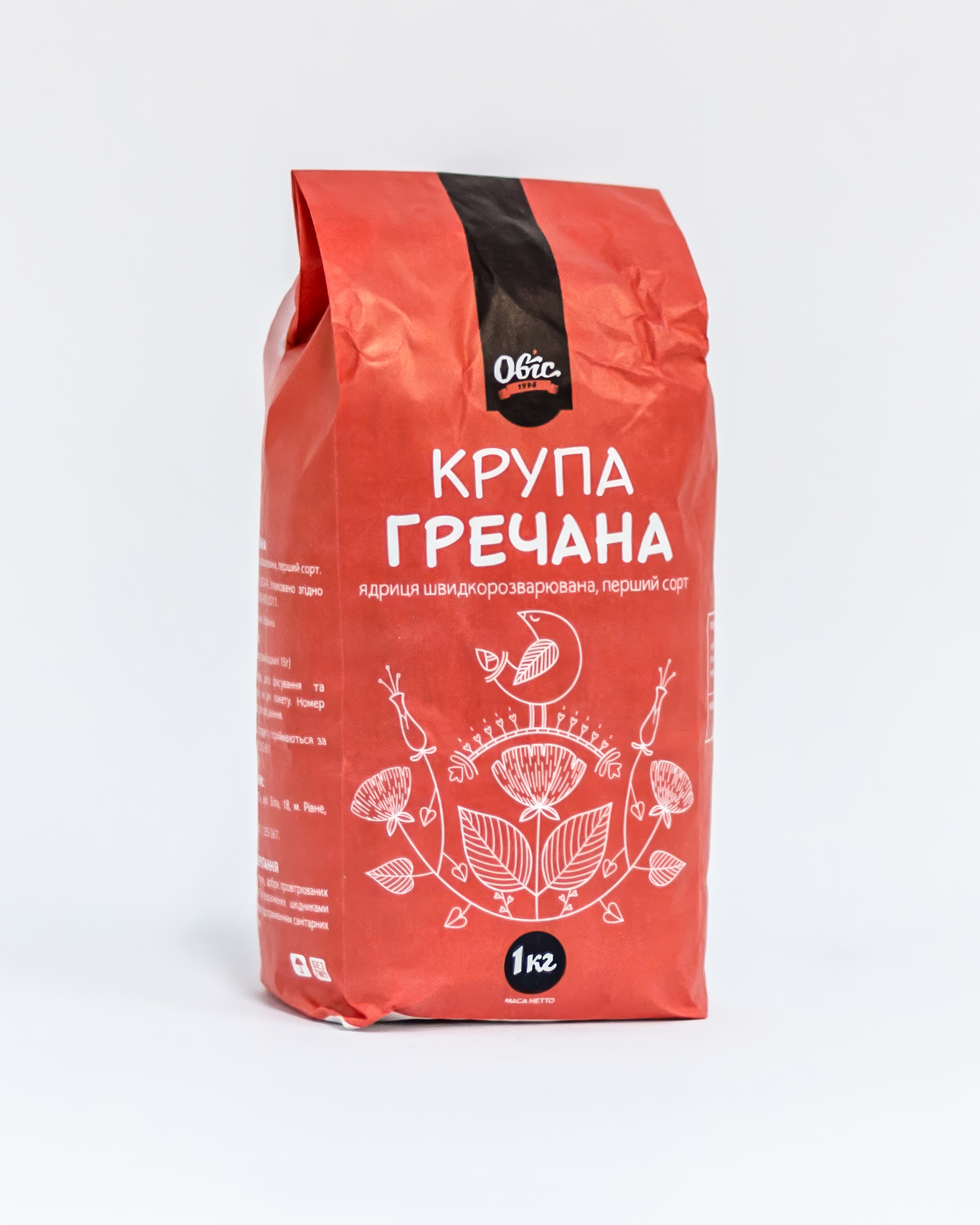
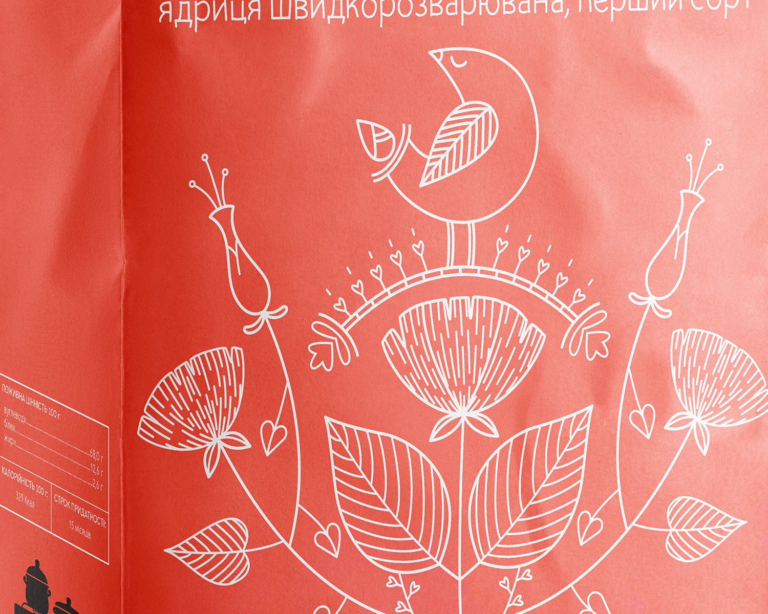
The buckwheat package uses a warm coral-red background to distinguish the product within the range while keeping the product name and weight visually dominant. The illustration fills the central field and builds directly from the crop itself. Broad leaves, small grains and flowers at different stages of bloom create the main structure, while a bird anchors the composition and introduces a familiar motif from Ukrainian decorative art. The combination gives the package a botanical character without turning the illustration into a literal depiction of the plant.
Long-grain rice
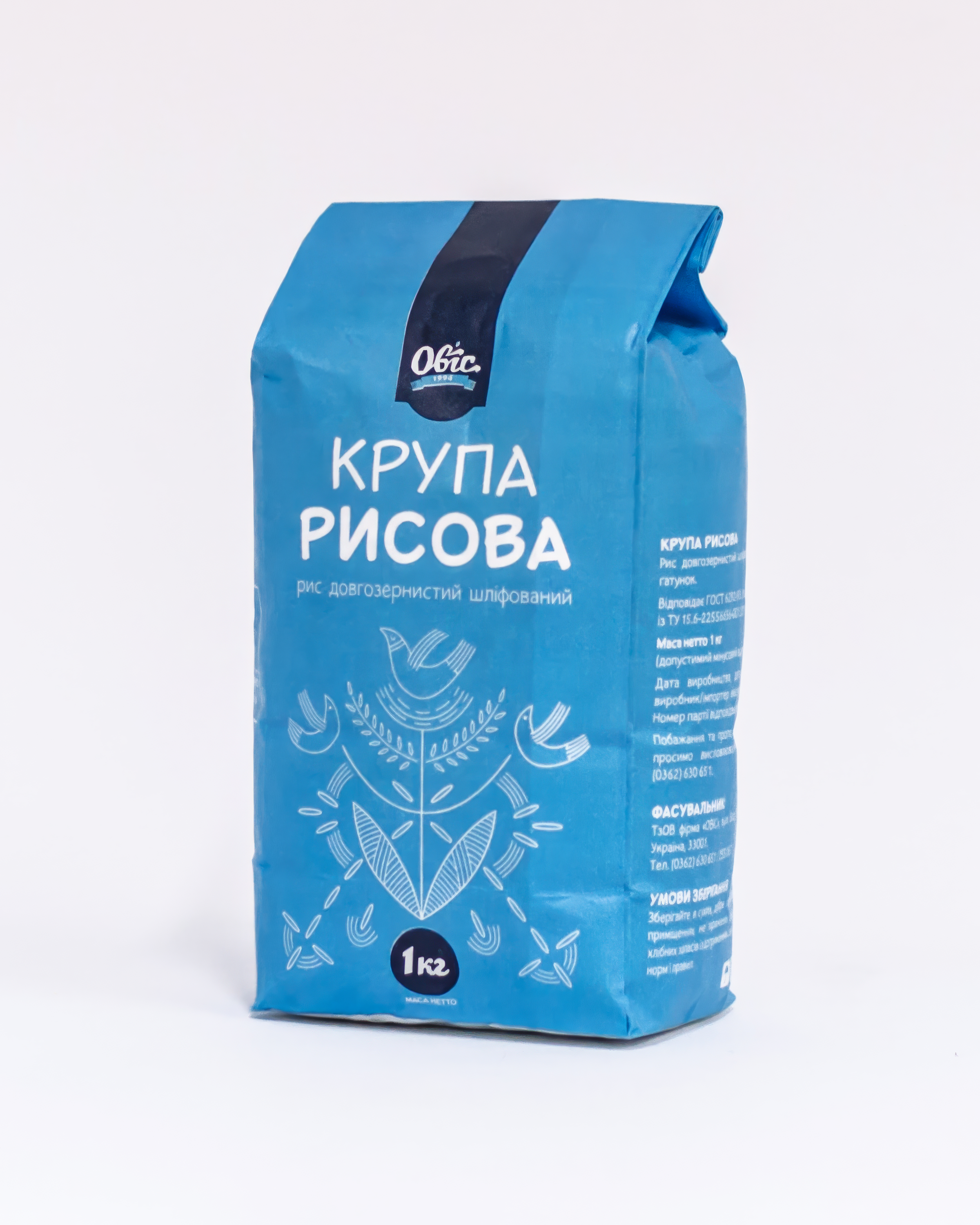
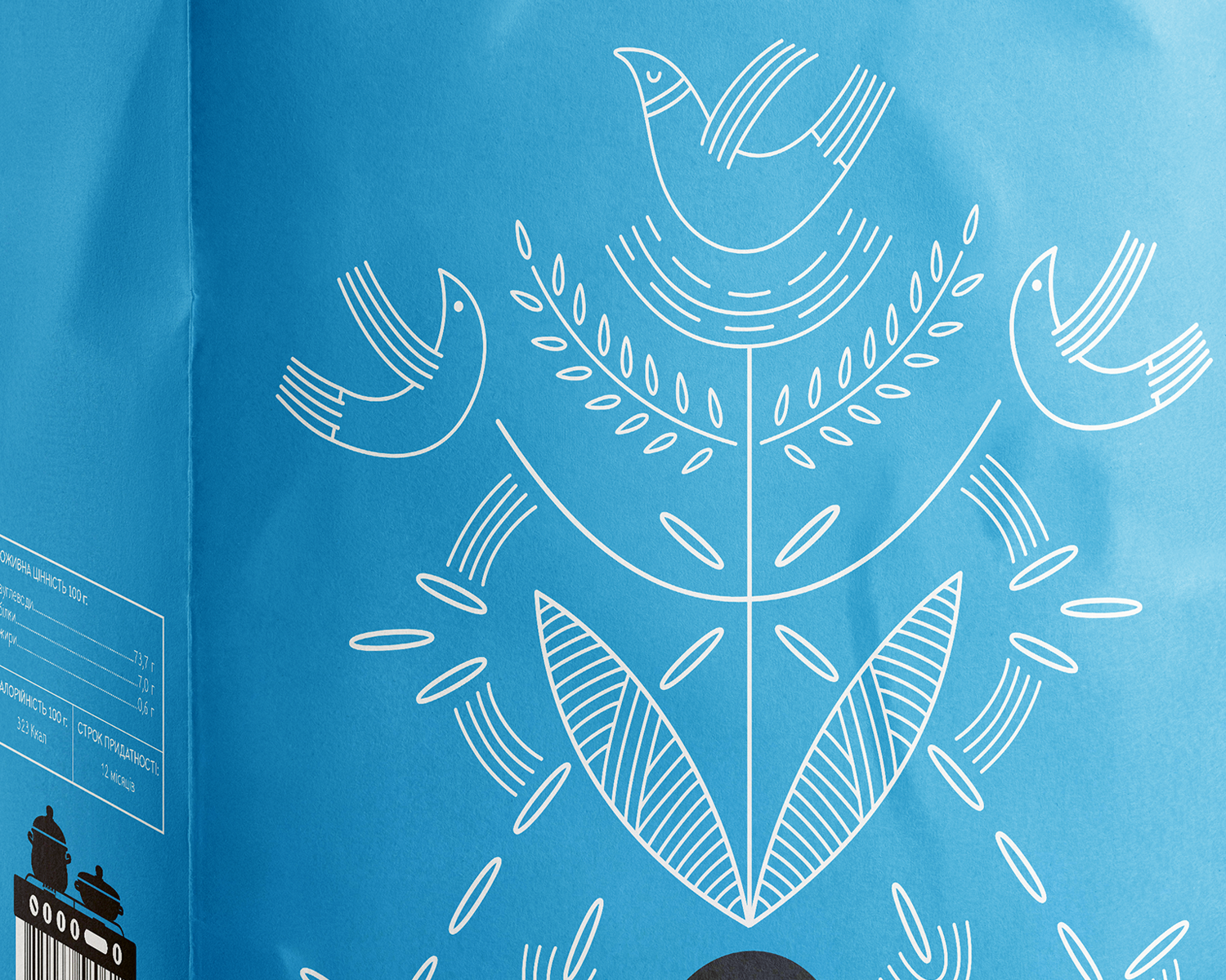
Bright blue distinguishes the long-grain rice from the teal short-grain variety and creates a related cool-colour palette for the two rice products. White typography and linework provide strong contrast, keeping the product name and weight immediately visible. The illustration draws heavily on the long, narrow proportions of the grain, repeating elongated rice shapes throughout the composition. Sweeping linear forms and stylized plant elements build around these shapes, with three abstract birds adding movement and balancing the composition.
Short-grain (round-grain) rice
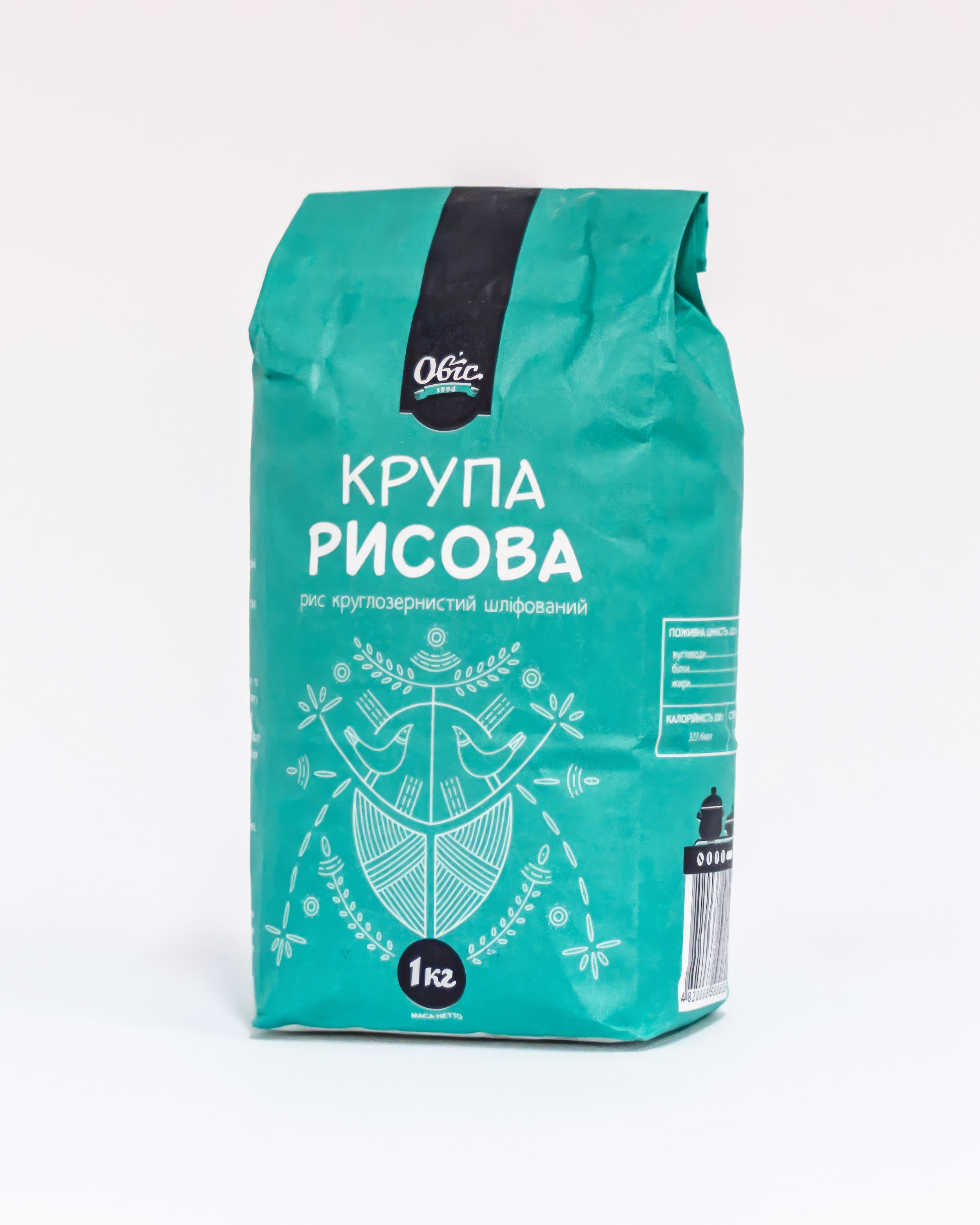
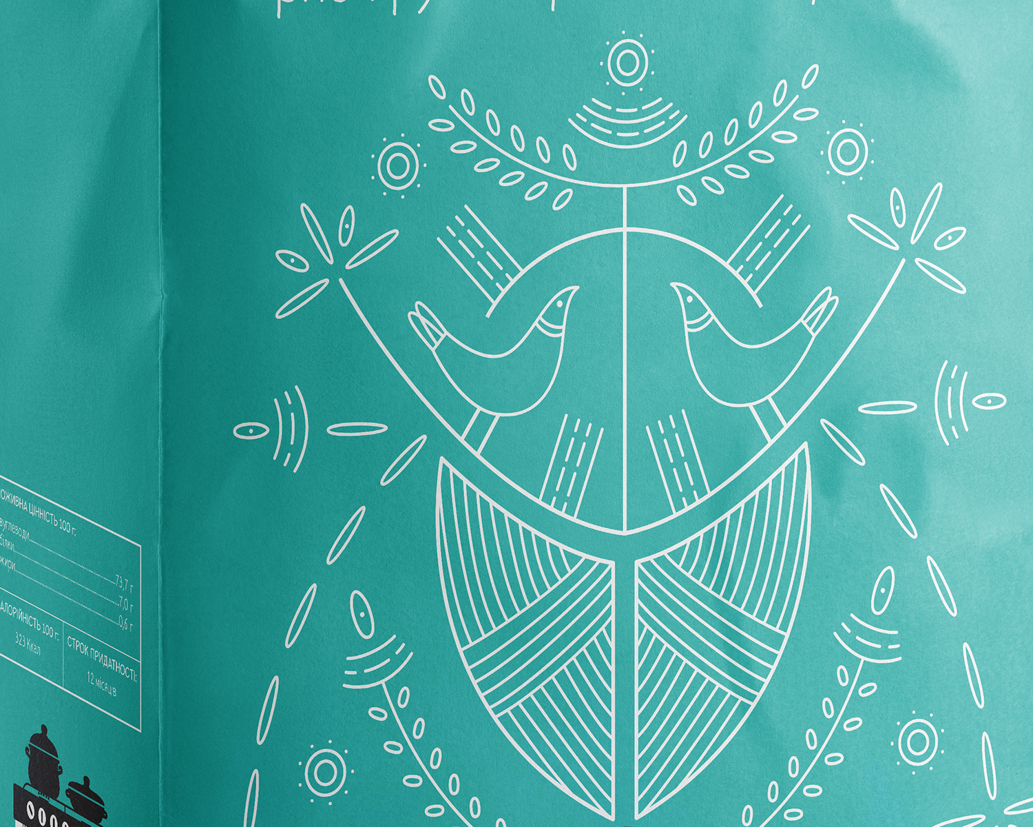
Teal connects the short-grain rice visually to the blue long-grain package while giving the variety its own clear identity. The illustration reflects the shorter, rounder proportions of the grain through fuller oval shapes and a more compact arrangement of elements. Two facing birds form the centre of the composition, surrounded by repeated rice grains, abstract plant forms and curved linear details. The denser geometry gives the package a character distinct from the more elongated long-grain design while keeping both rice products visually related.
Millet
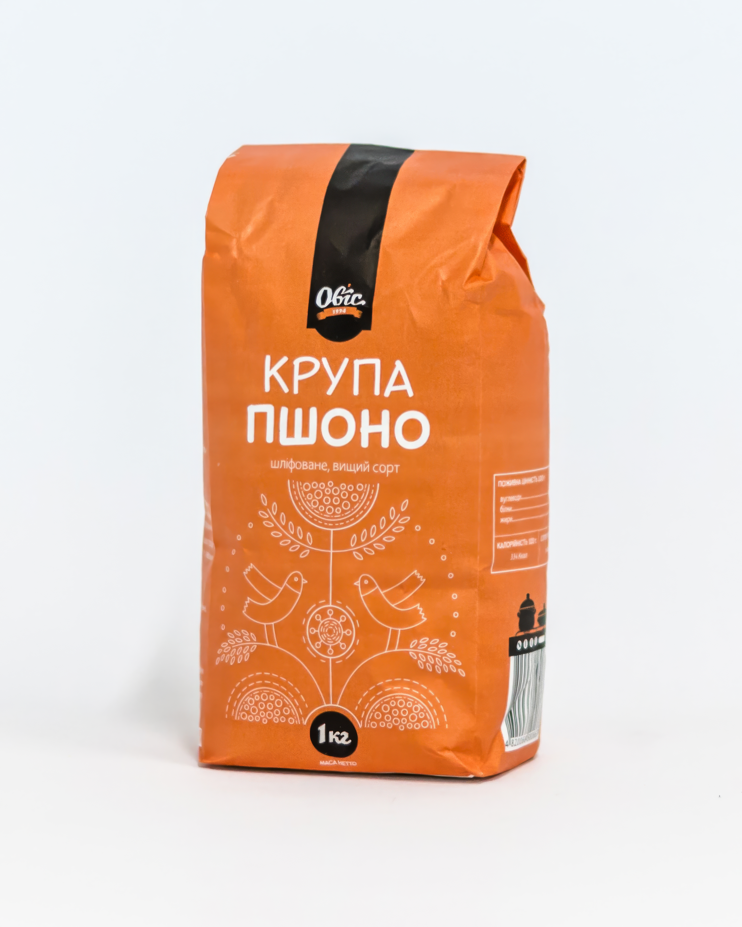
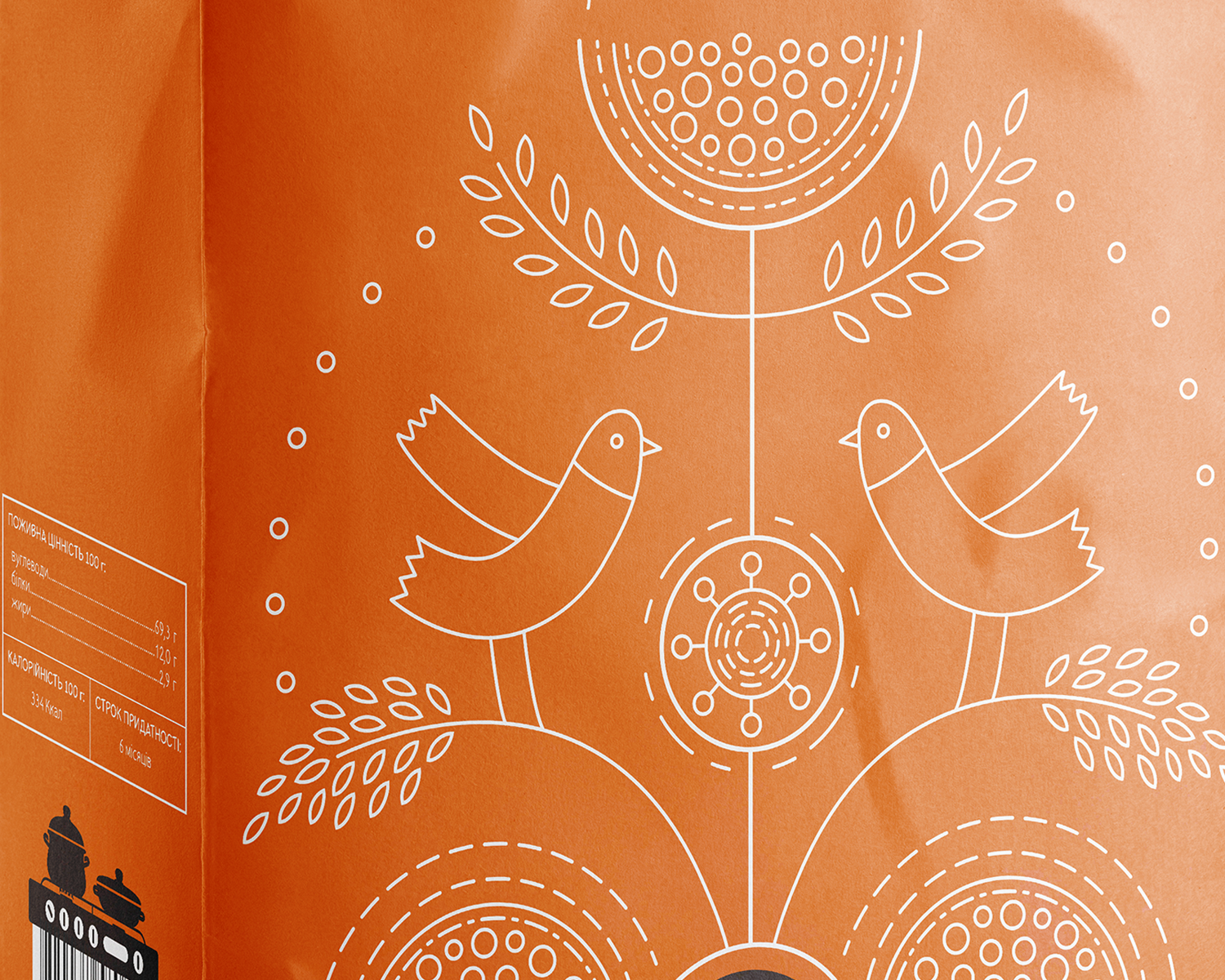
The millet package uses a warm orange background that relates to the golden colour of the grain and gives the product a distinct place within the range. The illustration occupies the central field without competing with the typography. Grain-bearing stems, individual seeds and abstract vessel forms build the composition around the crop and its use as food. Two birds form the central visual element, while repeated seed and circular shapes create rhythm across the package and reinforce the connection to grain and harvest.
Split peas
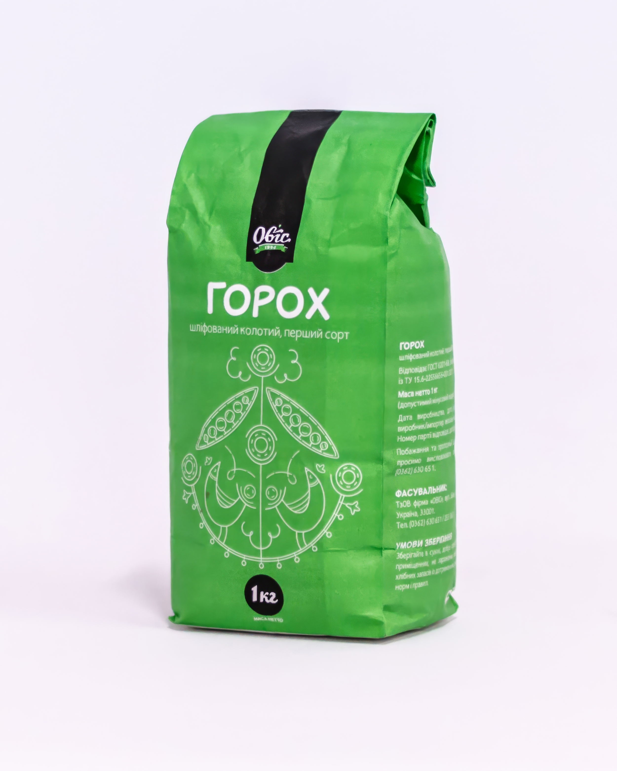
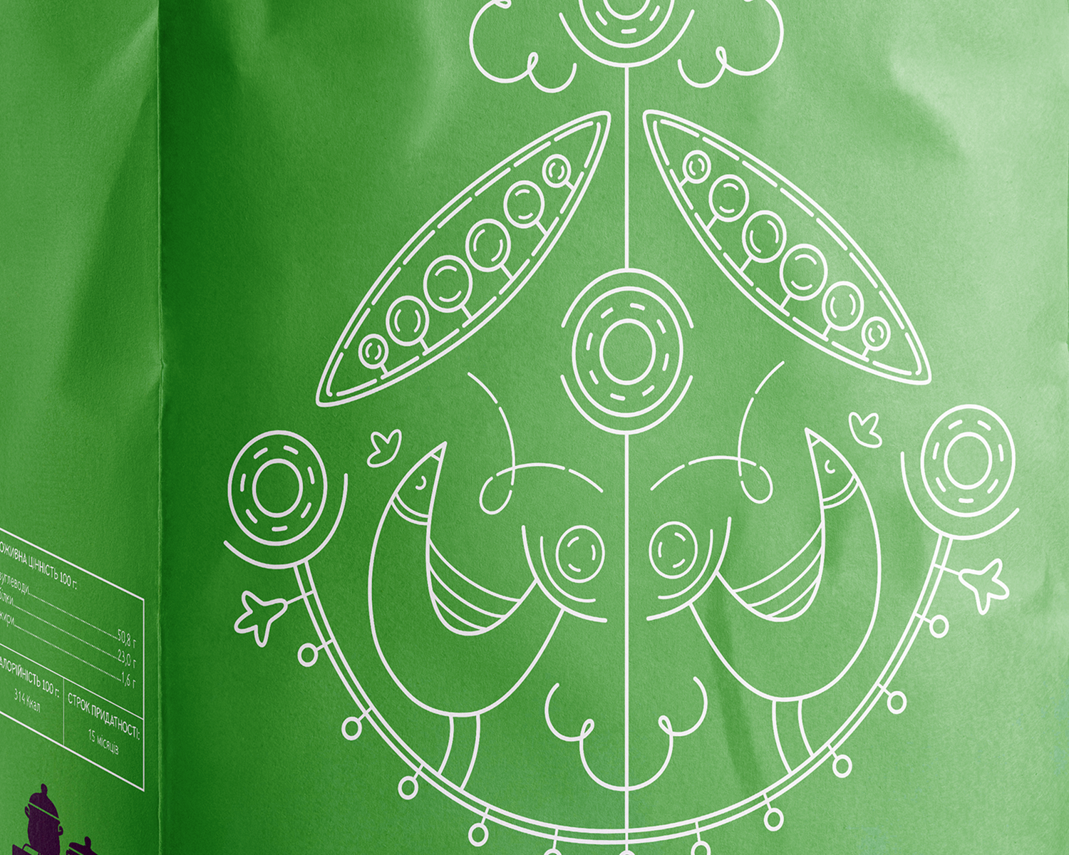
The split pea package uses a bright green background that connects naturally to the crop and separates it clearly from the other products in the range. White linework creates strong contrast while keeping the product name and weight visually dominant. The composition draws from pea stems, pods, rounded peas, buds and other spring-like plant forms. Two facing birds create the central symmetry, while repeated circular shapes echo the form of the peas throughout the illustration.
Wheat semolina
The semolina package uses a saturated magenta that creates strong contrast with the white linework and separates the product from the rest of the range. The illustration expands across the package while leaving the product name and weight as the primary information. Wheat ears and individual grains establish the connection to the source crop. Circular elements suggest grinding stones and the process of turning wheat into semolina, while simplified vessel-like forms reference preparation and serving. A central bird brings these agricultural and domestic references together within one composition.