Visual Identity for the City of Reynoldsburg, Ohio
Client: The City of Reynoldsburg, Ohio. The “Birthplace of the Tomato”
Firm: Guide Studio (Cleveland, OH)
Design problem: Reynoldsburg, a mid-sized city in Central Ohio, needed a new visual identity that celebrates its rich heritage and conveys its forward-looking community spirit.
Key challenges: The visual identity needed to convey the city’s vision as a dynamic growing community. At the same time, it needed to reflect Reynoldburg’s rich history. Moreover, the visual identity needed to be adaptable enough to allow for a multitude of brand extensions including events, initiatives, and municipal services.
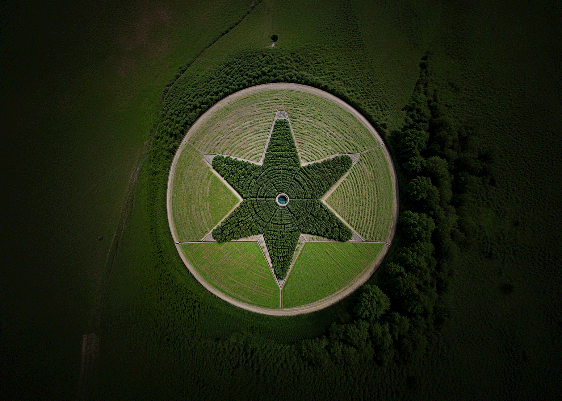
Design solution: The visual identity was built around the heritage star. This reflects the history of Reynoldsburg, where in the early 19th century the first tomato bred for commercial use was developed. The star shape also captures the city’s aspirations and spirit of excellence. Paired with a family of variable typefaces, the heritage star ensures the visual identity is flexible and adaptable.
My role: Concept design
Other roles: Guide Studio (client acquisition), Cathy Fromet (client communication), Gina Gerken (creative director), Kevin Fromet (design consultant), Caroline Chaikin (communication strategy), Jamie Wilhelm (alternative concept design), Alissa Miller (alternative concepts design).
positioningReynoldsburg—a vibrant and ambitious city with a rich history
Located near Columbus, Ohio, Reynoldsburg is an affordable but rapidly growing city with plentiful green space and abundant opportunities for commercial investment. The city offers easy access to urban amenities as well as outdoor recreation. In the early 19th century, in Reynoldsburg, Alexander Livingston developed the ‘paragon tomato’—the first breed suitable for commercial purposes. This legacy lives on through Reynoldsburg’s annual Tomato Festival held each August and a local museum dedicated to Livingston. This rich history, coupled with the city’s vision for its future, makes it an appealing destination for visitors and residents who call it home.

design explorationBranding Reynoldsburg: a Community-Centered Approach to Developing Visual Identity
Guide Studio conducted a brand development discovery in Reynoldsburg, Ohio. This involved interviews and workshops with stakeholders and residents, which yielded data detailing residents’ perspectives on the city’s character, feedback on the current city branding, and personas for Reynoldsburg residents. With these materials in hand, Guide Studio’s staff designers, including myself, began the design ideation process. I aimed to create a visual symbol that reflects the city’s values and aspirations for the future based on the extensive data gathered.
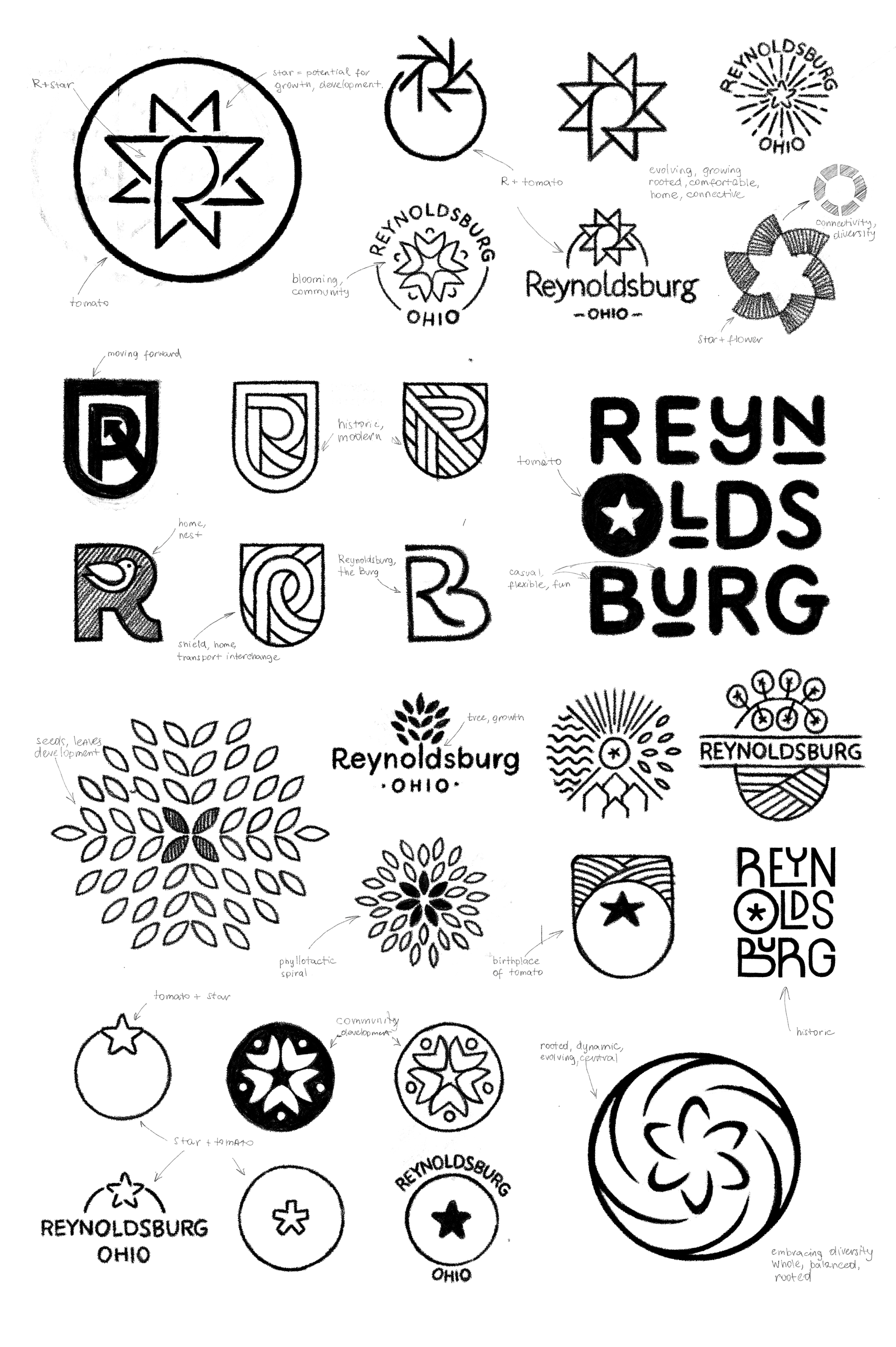
Concept 1: Reynoldsburg Roots
This concept integrates a stylized letter "R" with the sepals of a tomato plant, paying homage to Reynoldsburg’s history. The stem of the letter “R” forms the stem and roots of the fruit, symbolically connecting Reynoldsburg’s past to its bountiful future. This design also references Reynoldsburg's previous logotype, which was developed around the letter "R".

Keywords:
Growing, Dynamic, Connected, Rooted, Central, Comfortable, Home


Concept 2: Verdant Vision
This concept integrates a stylized letter "R" into a crest. The counter within the "R" resembles a tomato seed, nodding to Reynoldsburg’s past. The concept also evokes a top view of a landscape, with a roundabout highlighting Reynoldsburg's blend of urban amenities and greenspace.

Keywords:
Strong, Historic and Modern, Motivated, Connected, Balanced


Concept 3. Heritage Star
In this concept, a top view of a tomato and its sepals replace the letter "O" in Reynoldsburg. The design ties closely to Reynoldsburg’s history while highlighting it as a dynamic community that attracts and supports businesses and people. This design offers high flexibility, allowing the symbol to be used independently and integrated into various brand extensions.

Keywords:
Simplified, Heritage Star, Iconic, Versatile, Clean, Heritage, Nature


Concept 4: Blooming Synergy
This concept features a stylized flower and a six-pointed pinwheel shape. Rooted in the tomato flower, it pays homage to Reynoldsburg’s history. The curved segments create a sense of motion, highlighting the city’s dynamism. These curved elements can also converge into a circular shape, symbolizing the diversity and vibrancy of the Reynoldsburg community. The focal point within the pinwheel denotes Reynoldsburg's central location in Ohio.

Keywords:
Growing, Dynamic, Diverse, Connected, Central, Balanced


design solutionCultivating Identity: A Flexible Design Rooted in Reynoldsburg's History
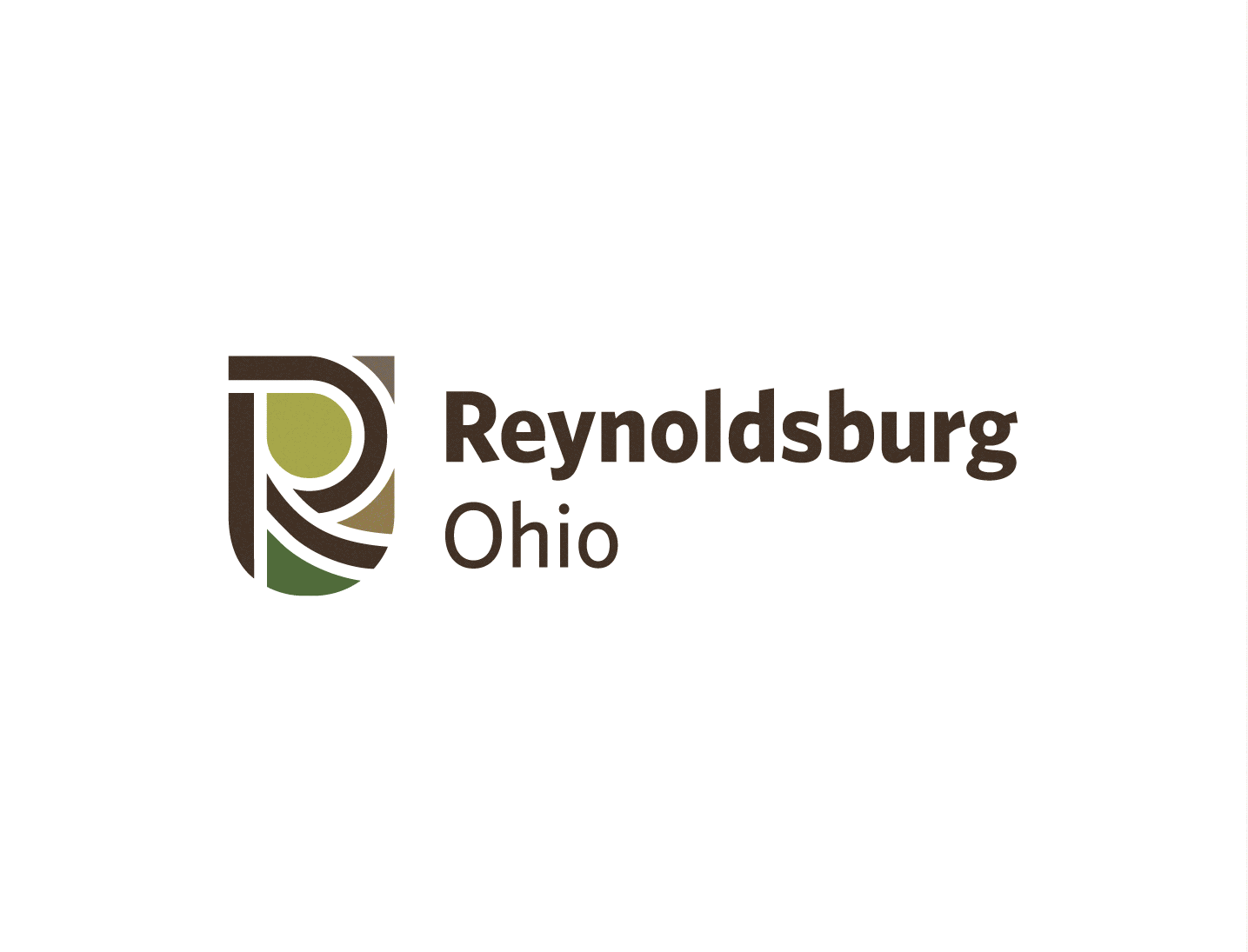
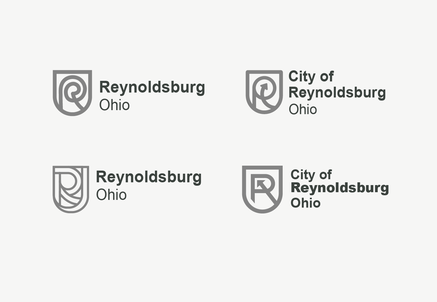
The City of Reynoldsburg considered numerous design options, including the four presented here. Ultimately, they selected my “Heritage Star” concept as the foundation for their final visual identity. This highly flexible and memorable symbol encapsulates Reynoldsburg's past, aspirations, and spirit of excellence. Using the heritage star in place of the letter “O” provides a versatile yet cohesive visual cue for brand recognition. My internship with Guide Studio concluded by the time Reynoldsburg made its selection, so my colleagues took the visual identity and its extensions to completion.
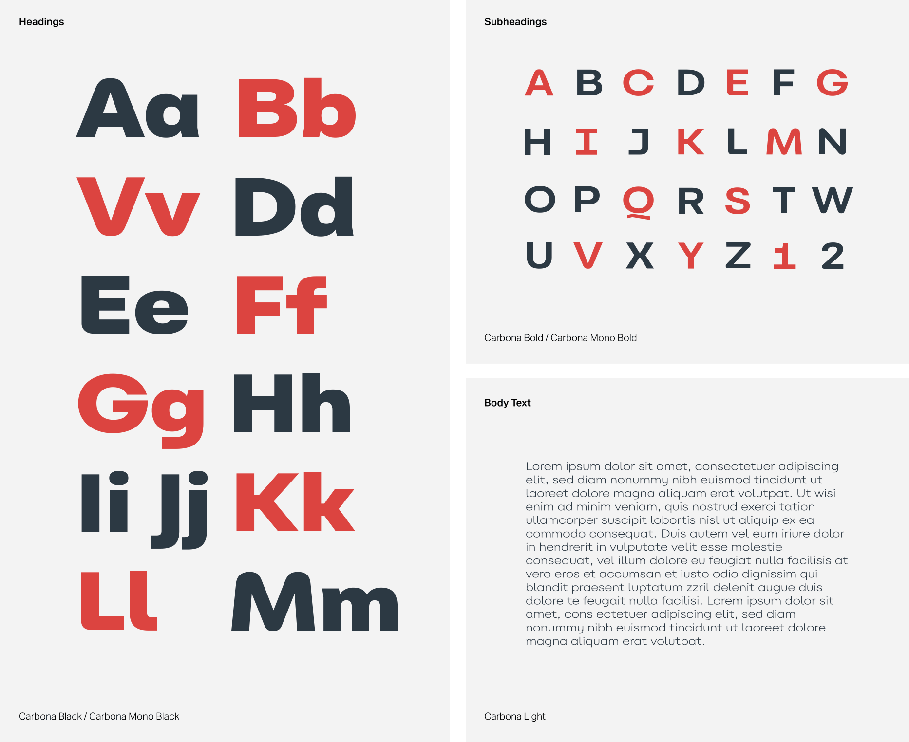
Below, I present the Reynoldsburg visual identity as I envisioned it with more time. I utilized the Carbona variable type family, offering both variable weight and character width, enhancing design flexibility. This approach ensures typography can adapt easily, creating distinct visual identities for events, initiatives, or departments. The color palette is versatile and dynamic, blending strong, classic tones such as navy blue and red with earthy and vibrant secondary colors. It captures the traditional and natural aspects of Reynoldsburg, presenting a cohesive and visually appealing representation of the city’s diverse character.


brend extensionsMaintaining Visual Cohesion throughout Reynoldsburg's Numerous Initiatives
The adaptable branding for Reynoldsburg allows for a multitude of brand extensions, including the Reynoldsburg Tomato Festival, the Reynoldsburg Department of Parks and Recreation, and many others. By consistently applying symbols, typography, and color, these extensions maintain a cohesive identity while expressing unique messages relevant to their respective roles. This creates a hybrid brand architecture where each extension maintains a distinct visual connection to the parent brand.

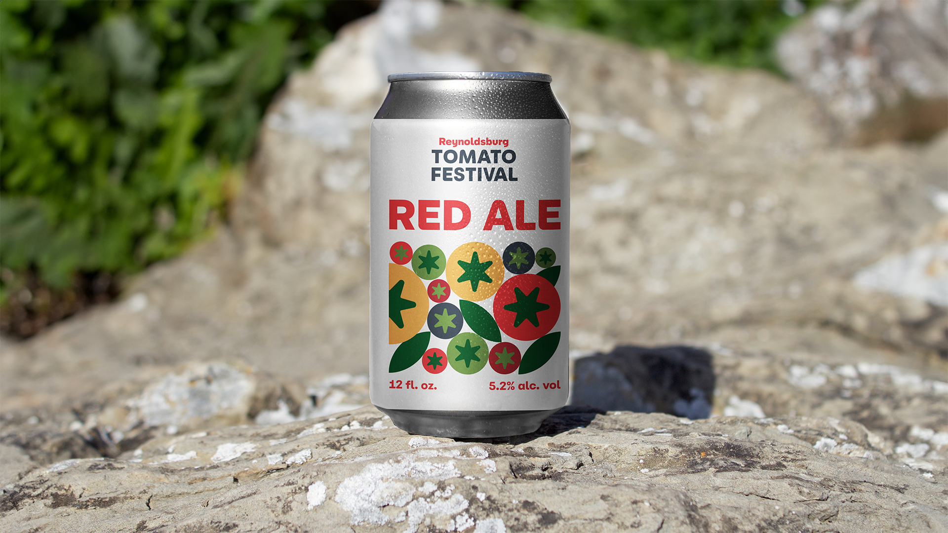
Visual identity for annual Reynoldsburg Tomato Festival
This visual identity integrates the heritage star from the parent brand, featuring a colorful variety of tomatoes of different sizes stacked together. This design utilizes the visual elements and color palette of the parent brand, reinforcing brand recognition while emphasizing diversity and abundance. It effectively captures the essence of the festival, reflecting its colorful and vibrant atmosphere.


Reynoldsburg Parks & Recreation Department
The Reynoldsburg Parks & Recreation visual identity maintains visual consistency with the parent brand while offering highly flexible arrangements for use across various platforms. It incorporates the heritage star, symbolizing the community, alongside relevant icons that reflect objects and activities commonly associated with parks and recreation. This concept can be easily adapted to include icons relevant to other departments or initiatives within the city.


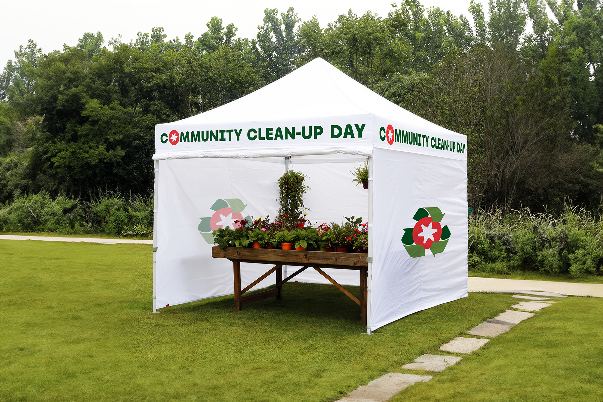
Reynoldsburg Community Clean-Up Day
The visual identity for Reynoldsburg Community Clean Up Day incorporates the tomato symbol from the parent brand within the widely recognized recycling symbol. This design maintains visual consistency by utilizing the same color palette as the parent brand. It is versatile and can function as a stand-alone symbol or as a replacement for the letter "O". The recycling symbol communicates environmental stewardship, while the heritage star emphasizes the proactive communal spirit of the event.