
Design for Ship Life, a non-fiction book about working on a cruise liner by Olga Melnyk
Client: 21-Publishers (Ukrainian publishing house), and Olga Melnyk (book author).
Design problem: Shiplife by Olga Melnyk, is a non-fiction book about her experience working as a waitress on a cruise ship. It required a design that would visually encapsulate the essence of life at sea while ensuring coherence and engagement for the reader. The design needed to reflect the dynamic and adventurous spirit of the narrative, as well as the challenging aspects of maritime life.
Key Challenges: the design needed to convey the maritime setting of the book and balance the challenging aspects of life on a cruise ship and the author’s emotional experiences. It also required shelf appeals to draw in potential readers while creating a cohesive visual narrative throughout the book.
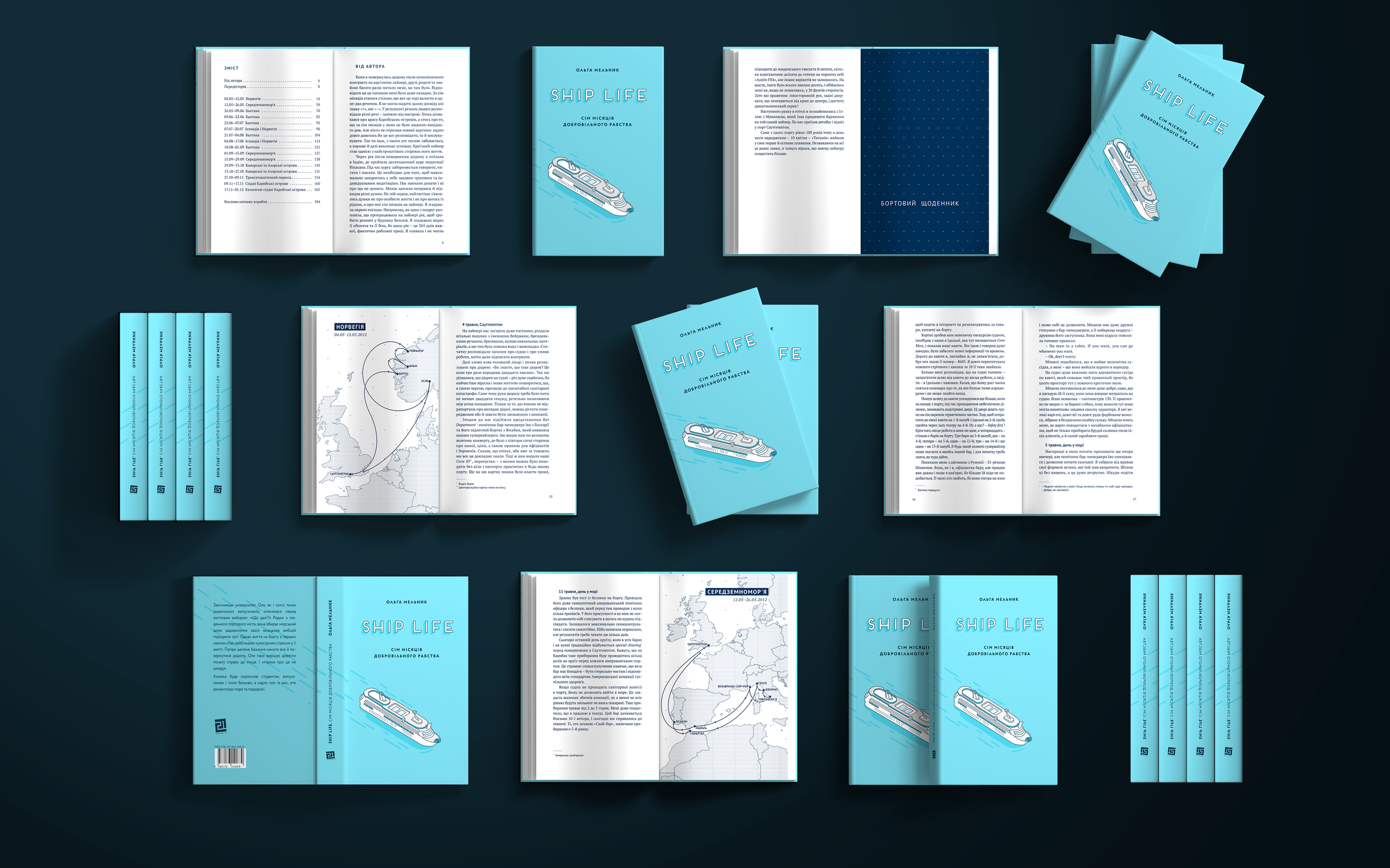
Design Solution: the final design captures the nautical themes of the book. It utilizes a teal blue cover with selective varnish, ocean-inspired endpapers, and navy blue monochromatic illustrations to evoke the ocean's vastness. Monochromatic maps help the reader follow the author’s travels aboard the cruise ship and reinforce the author’s adventurous spirit. The book has an eye-catching and consistent look that extends from the cover to the endpapers. It makes the book easily identifiable on a shelf and draws readers into an informative and memorable experience.
My Role: client acquisition, design, and illustrations.
Other Roles: layout (Alyona Oliynyk), preprint preparation (Alyona Oliynyk, 21-Publishers)

DESIGN EXPLORATIONDesigning Ship Life: Collaborative Research and Ideation
In consultation with the author and the publishing house, I conducted extensive research to inform my design for Ship Life. I interviewed the author to understand the key experiences she felt were central to the book’s narrative and overall message. I also consulted the publishing house’s internal research to grasp the book’s target market, positioning, and production cost constraints. Based on this research, I developed several potential design approaches. One of them was a typography-led design that uses text as the primary visual element. It would feature minimalist monochromatic compositions created from text to depict the narrator's journey aboard the ship. The cover, endpapers, and chapter dividers would use text-based patterns inspired by the abstract forms of ocean currents and bathymetric maps. This design would intersperse minimalist yet powerful elements throughout the book to evoke the ocean's expansiveness and reinforce the narrator’s emotional experience.

I also explored a collage-based visual design for Ship Life to convey a diary-like nature of the book. This idea could integrate the author's own photographs of cruise ship life and ports of call with hand-drawn elements, abstract geometric shapes, and torn paper pieces. The cover could feature a collage of an iceberg in an homage to the unseen challenges and difficulties that lie at the heart of working on a cruise ship. This approach would enhance the visual narrative and capture the author's personal journey, making Ship Life visually engaging and emotionally resonant.

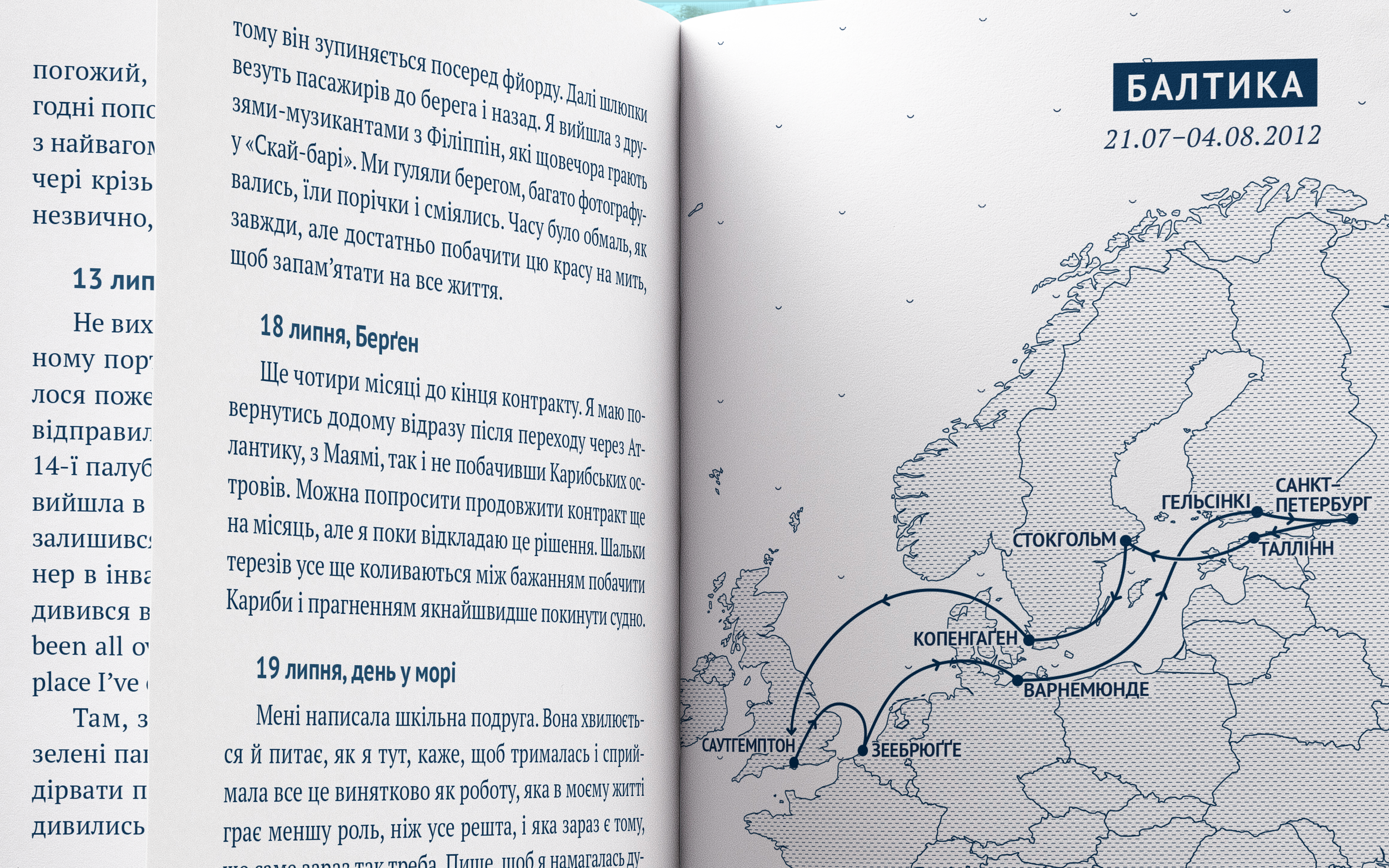
Finally, I explored an idea that captures the idyllic nature of life on a cruise ship. This concept channels the author’s initial notions of life working on a cruise ship, rather than her actual experiences. This concept could utilize monochromatic blue text, illustrations, and ocean-inspired patterns to evoke a sense of serenity and vastness. The book could feature highly accurate maps like those featured in school textbooks to capture the author’s adventurous spirit and allow the reader to follow her travels.

After further consultation with the author and the publishing house, we proceeded with the third design idea, it was conceptually strong and effectively conveyed the author’s intent. The final design utilizes teal and navy blue colors to capture an idyllic nautical theme. The cover depicts a cruise ship and incorporates selective varnish to add a tactile element. The book’s interior is printed using a single navy blue Pantone, fitting well with production cost constraints and simplifying the printing process by using the same color for text, endpapers, chapter ends, and illustrations. The book features a series of highly accurate maps showing the routes traveled by the author while aboard the cruise ship. This clean, visually appealing design ultimately resonated well with the book’s broad target audience.


Ship Life's Success: From Signings to Digital Release
The book was well-received at several in-person book signings and events throughout Ukraine, two of which I attended along with the author and reviewers. Since its publication, Ship Life has been highlighted by several Ukrainian book bloggers as a must-read travel-related book. It was eventually re-published as an e-book with the same cover and visuals. Ship Life has maintained its eye-catching and visually appealing look, continuing to attract audiences long after its initial publication.


Olga Melnyk, Author:“Yuliya's design work on the book cover for the Ukrainian edition of my book Ship Life: Seven Months of Voluntary Slavery was exceptional, vividly capturing the essence of the narrative. Her detailed illustrations of cruise ship itineraries brought the port cities I explored to life, enhancing the reader's visual experience with depth and clarity. With 2000 copies published and sold, Yuliya's designs played a pivotal role in creating a visually appealing and engaging reading journey.”

Presentation of the book in Kyiv, Ukraine, 2018. Left to right: the author Olga Melnyk, the moderator Artem Chapaye, and the designer Yuliya Fedorovych

Presentation in Chernivtsi, Ukraine, 2018