
Packaging design for Berkje, a birch sap beverage
Client: Bosoogst, an importer of Latvian-made birch sap to the Netherlands.
Design Objective: create an appealing and functional packaging design for a sparkling birch sap Berkje that was relatively new to the Dutch market. The packaging needed to stand out on shelves to appeal to first-time customers, communicate the sustainable organic origin of the product, and establish a memorable brand presence for future products.
Key Challenges: balancing simplicity, impact, and cultural appeal. The design should be minimalist yet eye-catching and aesthetically appealing to the tastes of Dutch consumers.
Design Solution: the final design blends nature, elegance, and cultural relevance. It ensures that Berkje stands out in the marketplace and communicates its core values effectively to the Dutch market.
My Role: client acquisition, all aspects of the design and research process.
EXPLORATIONEnchanted Birchwood Sparkle Embodying the Forest Spirit
Berkje is a high-quality, natural, and organic product. My research into the market, the audience, and the product clarified that the designs should communicate Berkje’s organic and natural qualities. It should ensure that Berkje is perceived not just as a drink but as an entire experience. The design could also integrate visual references to local culture, history, and art to ensure the product is relevant and appealing to the Dutch market.
Berkje would initially be produced in a single flavor; however, there are plans to include more flavors and products later. The packaging design needs to be easily expandable by incorporating distinct yet harmonious colors and accents. The overall branding of the product requires the capacity to incorporate other distinct products into a cohesive brand.

Concept 1. Nature’s Synergy
This design emphasizes the natural origin of birch sap and invites consumers to appreciate the delicate balance of nature. It blends realistic grayscale illustrations of animals with vibrant abstract forest landscapes in the background. The labels are playful and symbolize the interconnectedness and synergy of the forest. Bold colors and unique visuals have the potential to grab consumers’ gaze and make it easy to build a cohesive yet distinct product line.


Keywords:
animal illustrations, interconnectedness, enchanting aesthetic, harmony


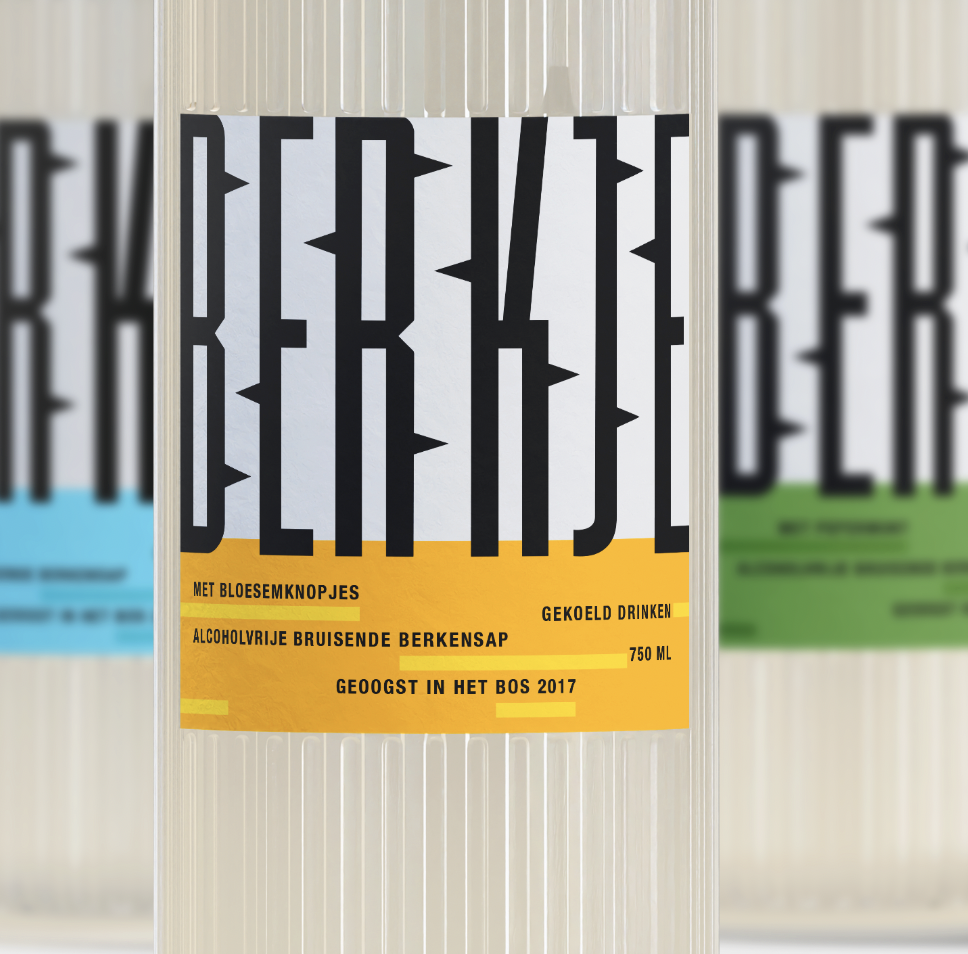
Concept 2. Typographic Forest
This simplistic concept emphasizes Berkje’s natural qualities while having a strong visual impact. The design features the brand name rendered in tall, capitalized, sans-serif letterforms. The figure-ground relationship between these letterforms suggests a birch forest landscape. The interplay of shapes results in a composition where the typography is visually striking while seamlessly conveying the natural origin of Berkje. The white space birch forest landscape adds depth and intrigue to the design, making it both functional and aesthetically pleasing.


Keywords:
bold letterforms, stylized type, abstract landscape, figure/ground Gestalt principle, high contrast, grid-like layout, clean, modern

Concept 3. Birchscape Essense
This concept blends modern minimalism with rustic charm, elevating Berkje from a drink to an experience. The clear glass bottle is adorned with bold, black typography and encased in a paper wrap featuring a striking black-and-white birch tree forest motif and rustic illustrations of forest animals unique to each flavor. The visual style of the illustrations draws inspiration from traditional woodcut printing techniques. The outer wrap protects the product but goes beyond mere packaging. Unwrapping the bottle becomes an experience that invites you to uncover the mysteries of the forest.


Keywords:
rustic style, woodcut prints, natural elegance, unwrapping experience, forest mysteries


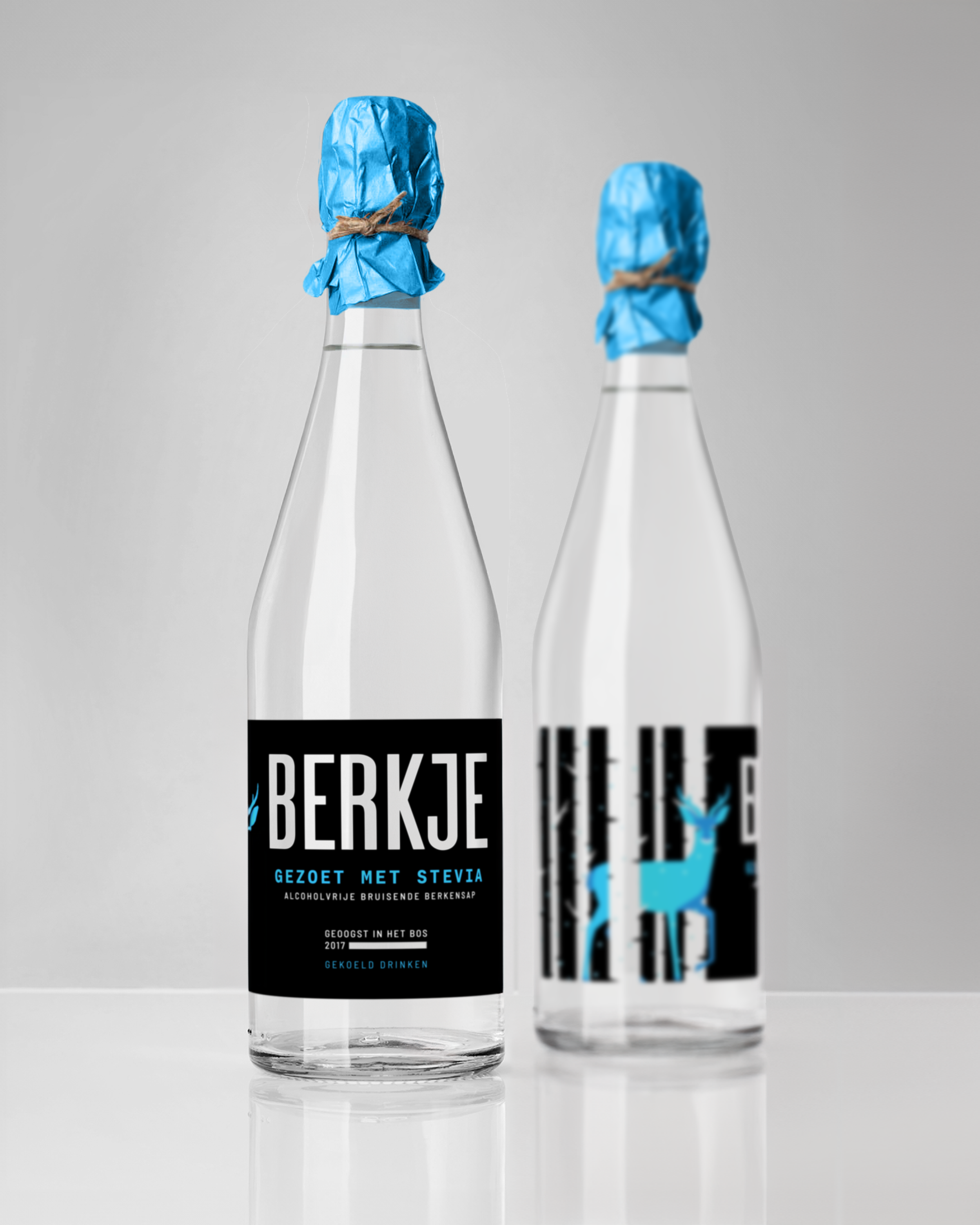
design solutionForest tales told through birchwood and bubbles
The final design builds on the ‘Birchscape Essense’ with adjustments to fit manufacturer constraints. This design highlights Berkje's natural characteristics while facilitating a broader range of distinct flavors and products. The design uses the interplay of shapes to depict the birch forest motif, with clear birch sap sourced from these trees filling the bottle and becoming an integral part of the scene. Each flavor showcases different forest animals and features a unique color palette, crafting a narrative for each flavor and enhancing the visual appeal of the product lineup.

Original Sap + Flower Buds
The design for the original flavor of Berkje features an illustration of a fox sitting amid the birch forest in the spring. The orange accent color evokes a sense of warmth and renewal. The fox gazing into the birch forest sets a peaceful and rejuvenating mood, inviting consumers to experience the natural purity of original birch sap.


Mint-Flavoured Sap
Mint-flavored Berkje showcases a jumping rabbit among the trees in a birch forest. The vibrant green accent colors capture late spring's lively and refreshing essence. The playful illustration of the rabbit conveys a sense of vitality that matches the refreshing taste of the mint-flavored birch sap.


Sweetened Sap with Stevia
Berkje, sweetened with stevia, features an illustration of a deer with bright blue accents. This winter motif, paired with the deer’s calm presence, evokes a tranquil and refreshing atmosphere, highlighting the natural sweetness of stevia and the pristine quality of the birch sap.


Lemon-Flavoured Sap
Lemon-flavored Berkje is illustrated with an owl flying around the birch trees in fall. The yellow accent colors and the dynamic scene of the owl in flight capture the essence of autumn. This design highlights the freshness of the sap and its zesty lemon flavor.


Packaging for Berkje: an adaptive design for a diverse product line
The final design concept for Berkje sparkling birch sap stands out not only for its aesthetic appeal but also for its flexibility. This visual identity can be easily adapted for additional products by altering the color palette and illustrations. The partially transparent label design can be applied across various product lines, making it ideal for expanding into other thematic foods and beverages. This adaptability ensures brand consistency while allowing for unique and recognizable packaging across a wide range of products.


“Yuliya is an outstanding professional, and the final design for Berkje surpassed our initial expectations. I was impressed not only by her creativity and technical expertise but also by her excellent communication and prompt work.”
— Jevgenija Solovjova, Bosoogst